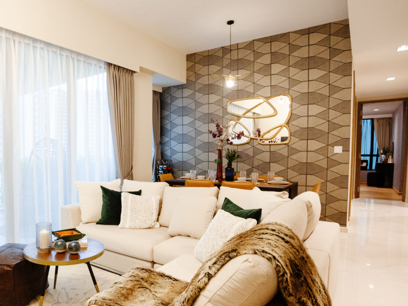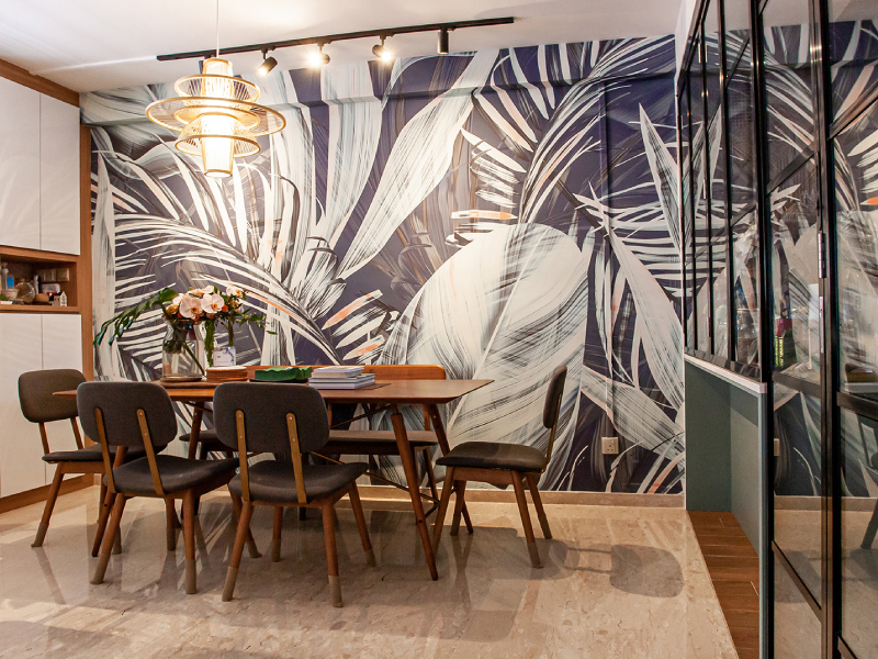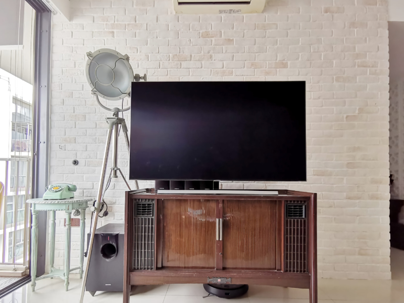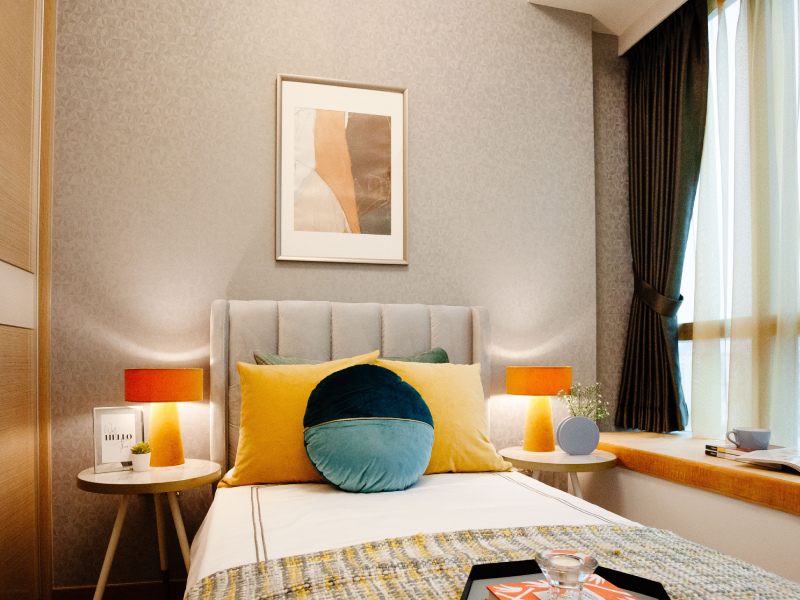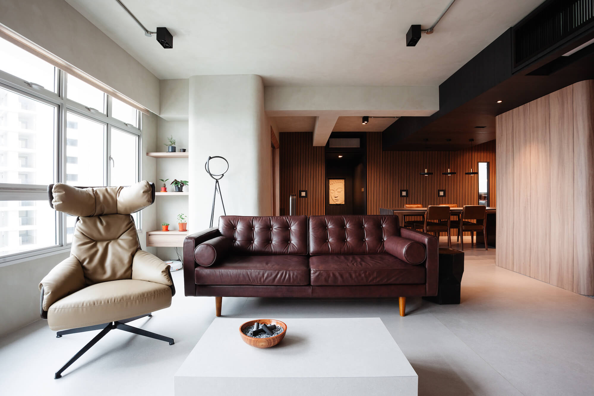
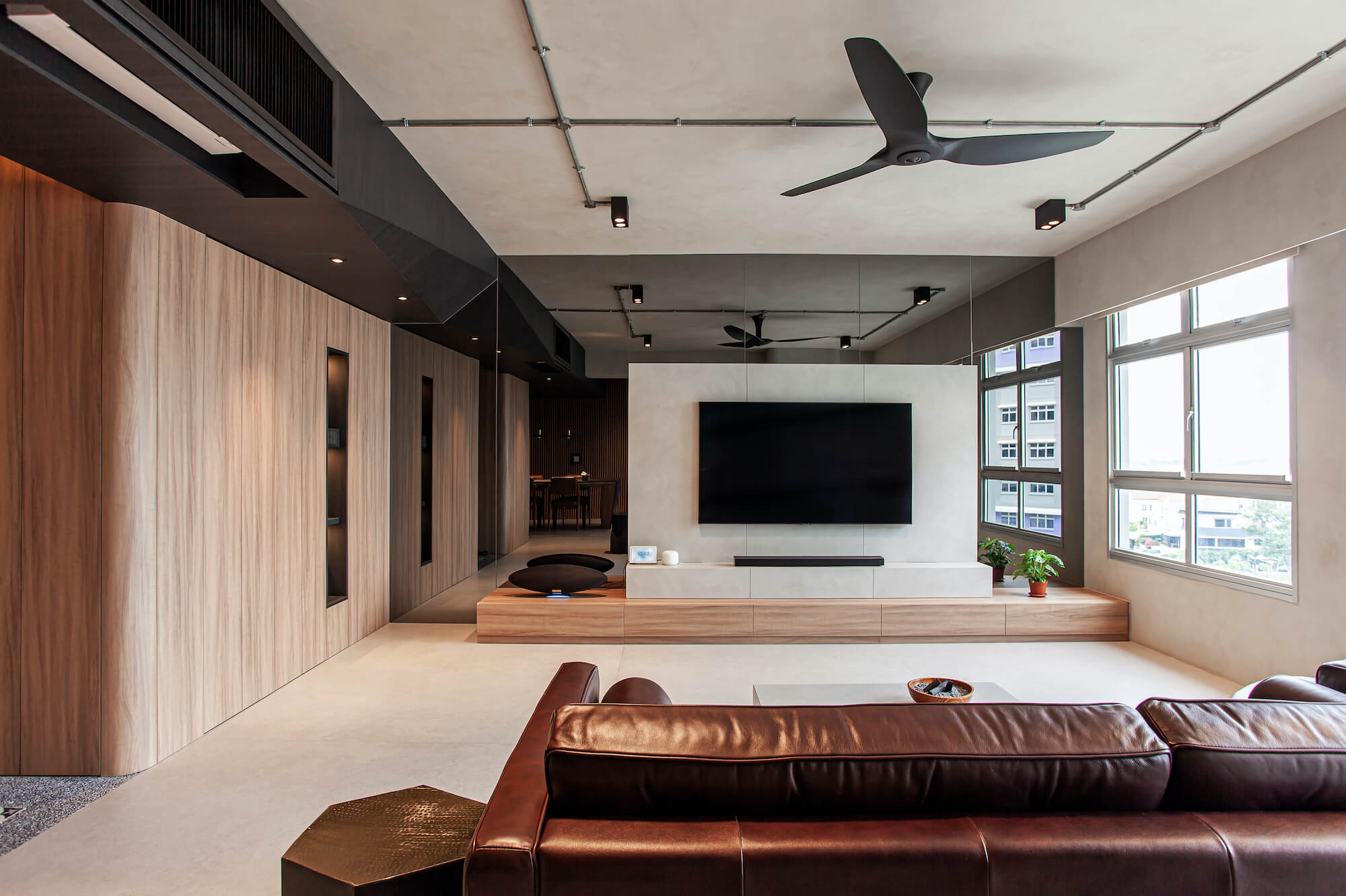
It may seem simple, but getting the Scandinavian Brutalism interior looking elegant is truly a balancing act. If you introduce too many concrete elements, you tip the scale towards creating a cold, hard space, like that of a prison cell. An excessive amount of wood and you find yourself losing the touch of the charming raw and honest imperfections.
With their palette of concrete and wood elements, statement pieces, and ambient lighting, Architect Kelvin Wang and his wife, Jocelyn, have definitely found the perfect balance in designing, detailing, and styling their home, “…brutally elegant…”
Take a peek into their beautiful home as Kelvin shares their design thoughts and tips with us. Read on!
Wallhub: Hi Kelvin! Congratulations on your new home, it is beautiful. Would you share with us a little about yourself and your design philosophy as an architect?
Kelvin: I am a locally registered Architect practising in a boutique architecture firm. It is my strong belief that a good design must not only be able to stand the test of time but should also encompass thoughtful details that contribute to the greater whole. A good design does not necessarily need to be complicated – sophistication can be achieved through the manipulation and use of simple material palettes and forms.
Wallhub: What is your design inspiration and approach for your home?
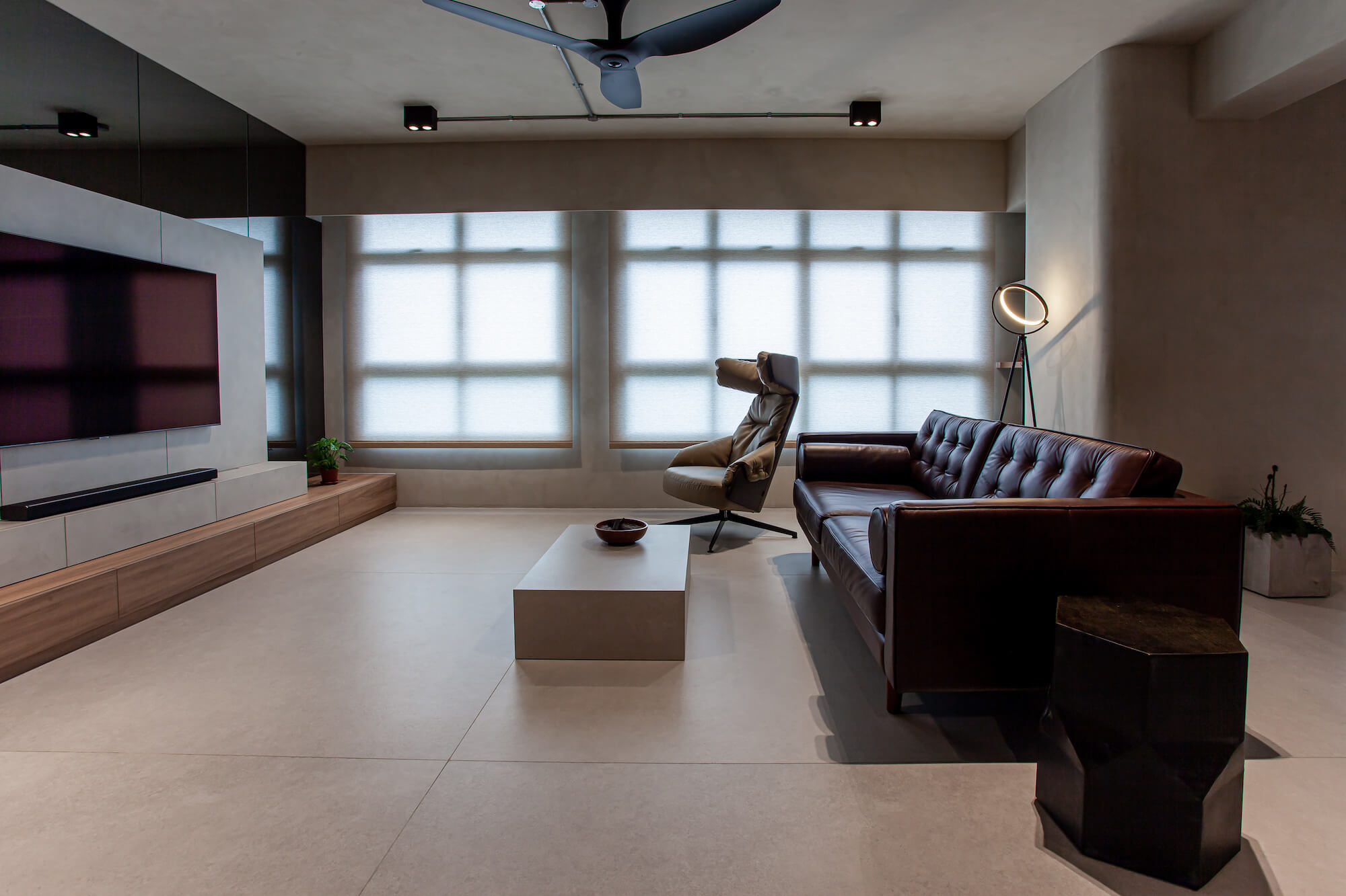
Kelvin: The design takes inspiration mainly from Brutalist architecture with the insertion of some Scandinavian characteristics. Jocelyn and myself are both fascinated with the monolithic and volumetric articulation of Brutalist architecture. We find beauty in the honesty of patinaed textures and how imperfections are shamelessly embraced. From the onset, we wanted to have those qualities incorporated into our home design. But of course, Brutalism in its pure self can be rather… erm brutal – lacking some warmth and sense of cosiness. To address this, we took some inspiration cues from Scandinavian design and incorporated elements of wood and green to tame the harshness.
Wallhub: We love the attention to detail of your spaces. What were your key considerations/challenges when designing this place?
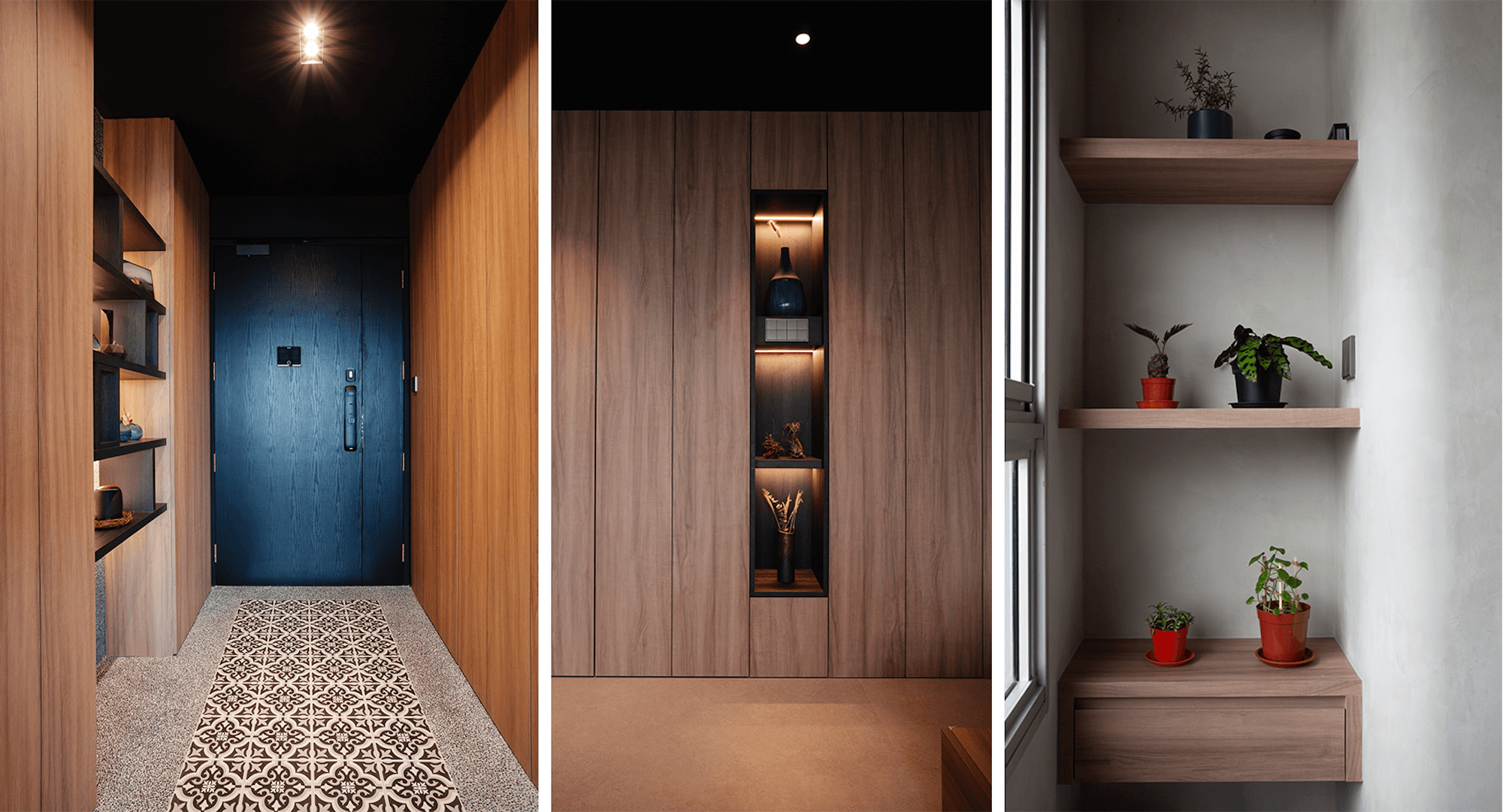
Kelvin: One of the most challenging aspects of designing our home was to consistently maintain the discipline to curate and keep the design in control. Many ideas have accumulated through my years of working as an architect, an interior designer and even a contractor – there were temptations to insert some of those previously rejected “what-I-think-are-great” ideas into the design. It was therefore necessary to sieve out only the good and compatible ideas and make sure they fit into the grand scheme of things.
Wallhub: If you have got to pick your favourite part of the house, which would it be and why?
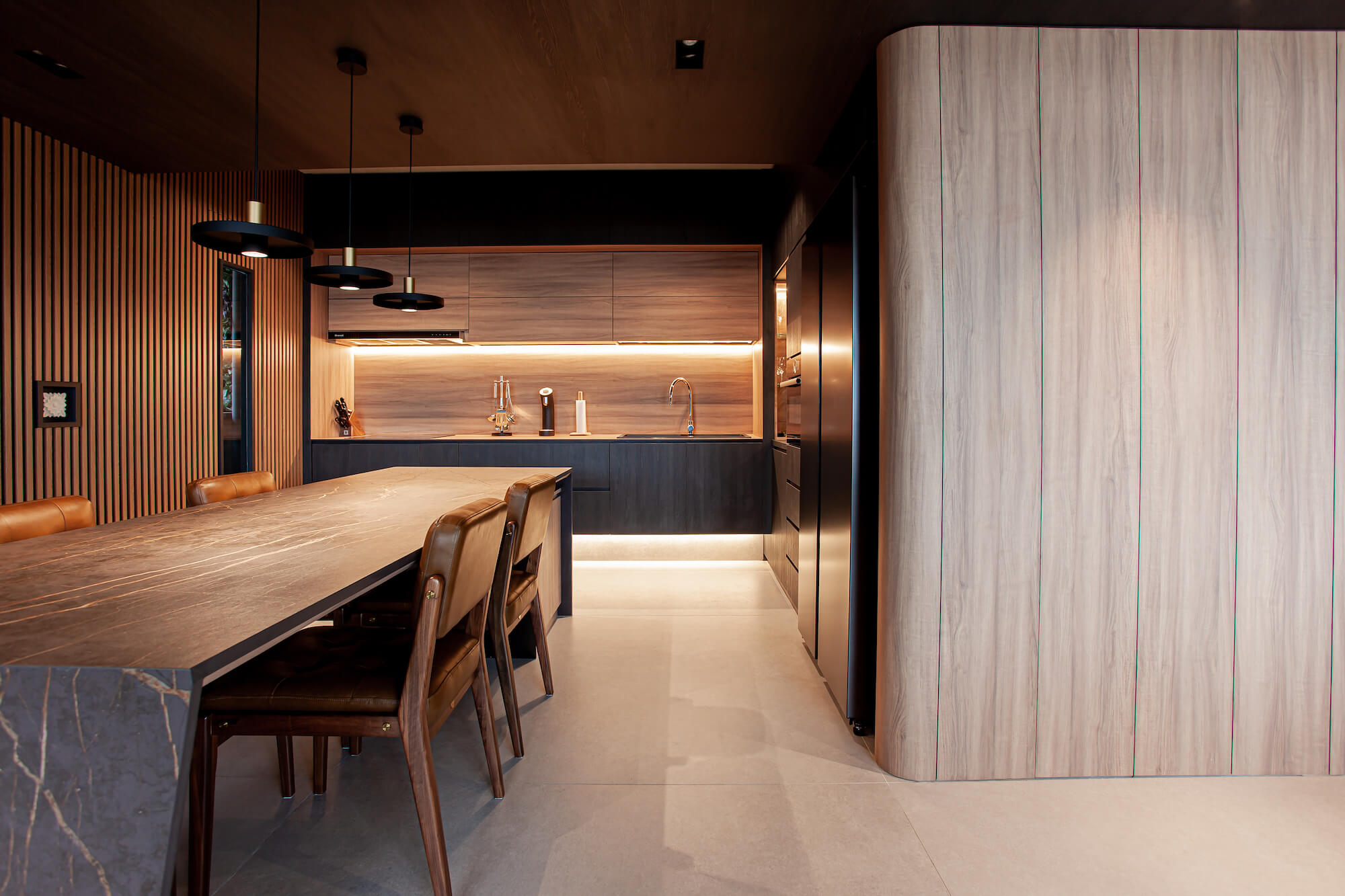
Kelvin: We are absolutely satisfied with how seamlessly the Living, Dining and Study has fused into a single large communal space. The Dining island has become the heart of the activity space. One moment we could be both eating on it, the next we could be working, an hour later we could be playing host to family and friends. When needed, the open layout of the communal space also allows us to take “small, private break-aways” into the Study and Living from the Dining but yet still be within visual reach of each other.
Wallhub: We are loving how you have the Strato® Textured Paint in SCT 309 – Ashes Grey, on your walls as well as your ceiling. How did you come about to decide on the cement paint as well as the colour?
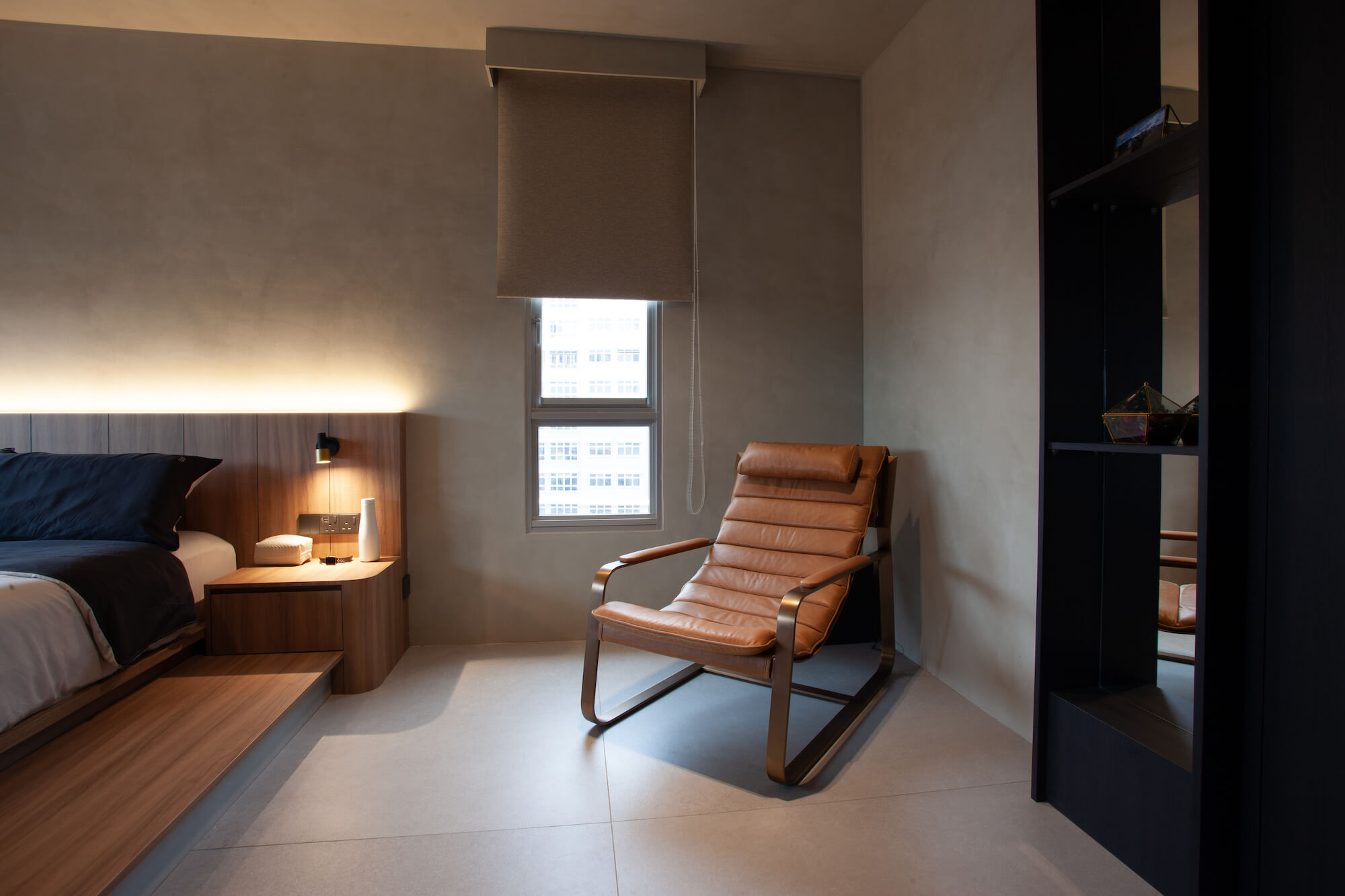
Kelvin: The initial plan was to go for cement plaster. However, after considering the usage of air-conditioning, and the application across different materials (concrete, brick, plasterboard), it is inevitable that cracking and chipping of the cement plaster will occur. It is hard to determine and control the fluctuations in humidity and different rates of contraction/expansion. Extensive prep work on the existing surfaces and additional cost will unavoidably be required. Hence, we decided to finish the walls and ceiling in cement-look textured paint.
SCT-309 was chosen as it closely matches the tile and laminate tones that we have selected – allowing a contiguous and homogeneous cement-look from floor to wall and ceiling. Not only is the Strato® Textured Paint crack resistant, but it is also low in VOC, formaldehyde & lead free. It would also be a breeze to care for in comparison to actual cement plaster over time.
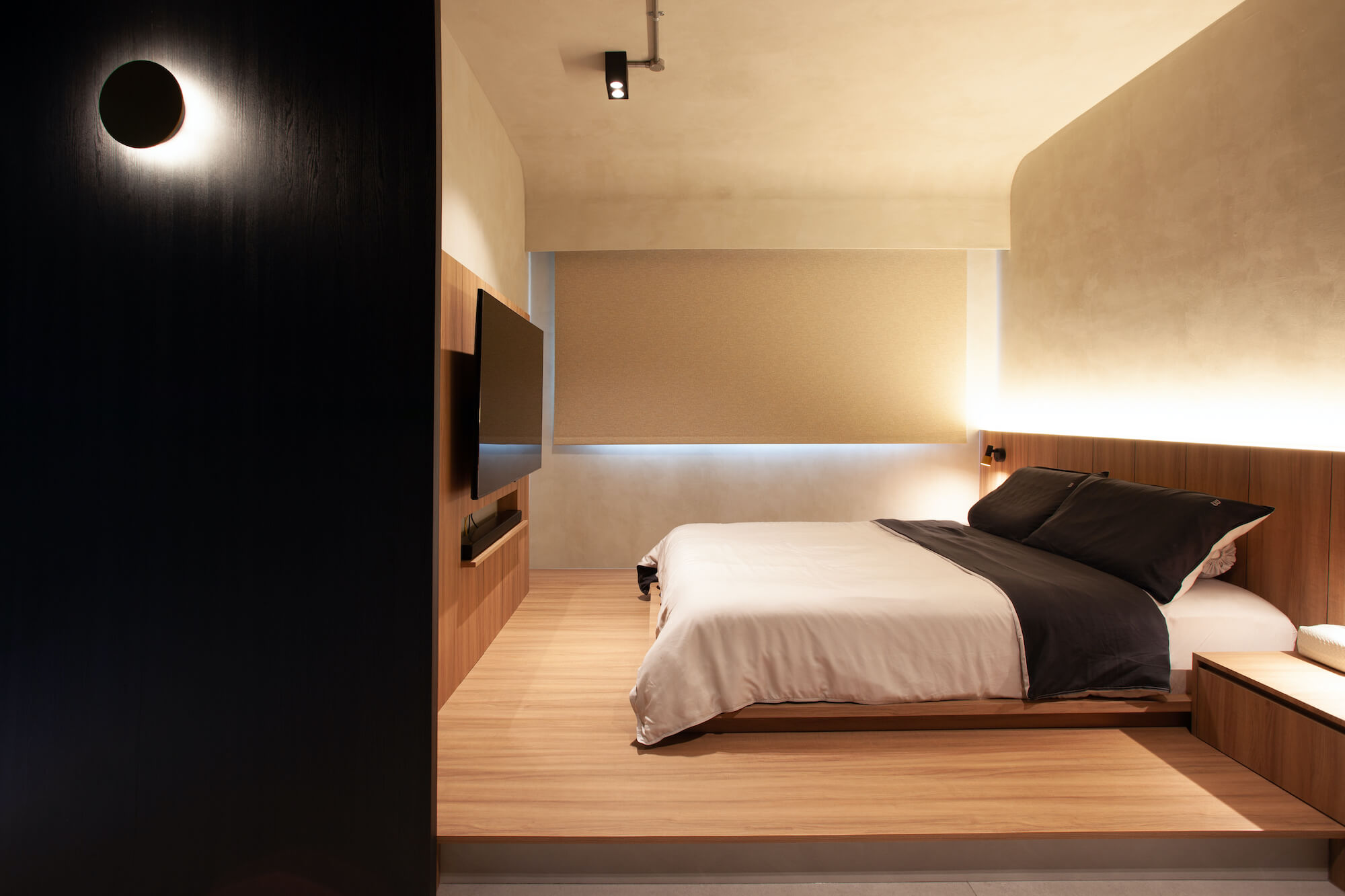
Wallhub: We are glad that you are loving the textured paint as much as we do! Do share with us your experience with Wallhub.
Kelvin: There is a large variety of wall finishes to select from. Cher, my sales consultant, was very responsive and helpful from the selection phase through to post-completion. The installers are very professional and take the utmost pride in their work.
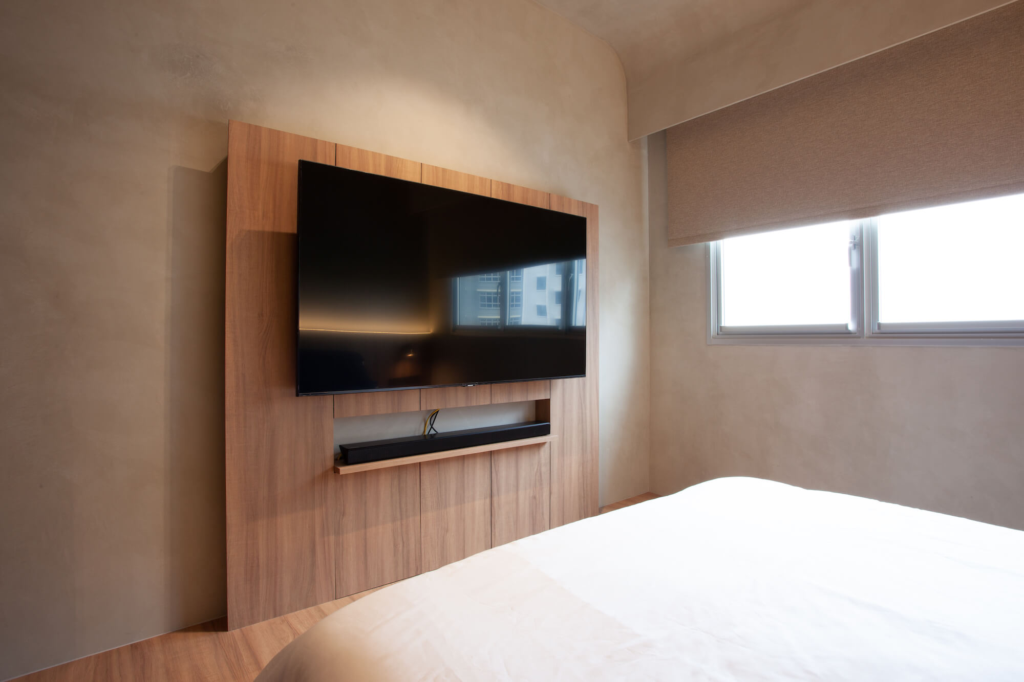
Wallhub: Thank you so much for taking the time to show us your home and for sharing, Kelvin! Would you have any tips for homeowners who would like to achieve this interior look?
Kelvin: When it comes to materiality, it is very easy to go overboard with colours – curate and control your material palette. Do not go overboard with splashing different colours everywhere. Think about lighting, both natural and artificial. They play an important role in creating different spatial experiences during different times of the day.
View more of Ar. Kelvin’s works here and for more peeks into the lovely spaces of #homewithwallhub, head on over here!
