The Best Wallpaper Colours For A Relaxing Bedroom Environment

The Best Wallpaper Colours For A Relaxing Bedroom Environment

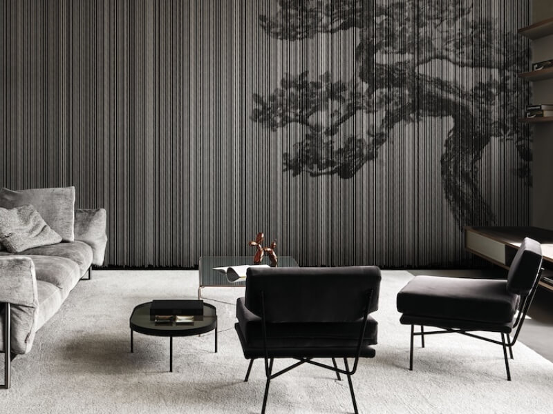
Your bedroom is more than just a place to sleep; it’s a personal sanctuary where you can unwind, recharge, and find peace. The design and decor of a bedroom have a significant impact on its atmosphere, and one of the most important elements to consider is the colour of the walls. Wallpaper suppliers in Singapore, provide a myriad of wallpaper patterns, textures, and colours – perfect for transforming bedrooms into calming retreats. The right wallpaper colour can evoke a sense of serenity, helping you relax and destress after a long day.

If you’re looking to create a peaceful environment in your bedroom, here are some of the best wallpaper colours to consider. 

1. Soft blues

Soft Blues

Soft, muted shades of blue are often the go-to choice for a relaxing bedroom. Blue is universally recognized as a calming colour, associated with the sky and water, and it has been shown to lower blood pressure and heart rate, encouraging relaxation. When it comes to choosing the right blue for your bedroom wallpaper, think of lighter shades like powder blue, baby blue, or pale aqua. These colours can make your room feel airy and spacious, perfect for winding down before bed. Avoid vibrant or electric blues, as they can be overly stimulating for a peaceful space.

Consider adding subtle patterns to your blue wallpaper, such as delicate stripes or small-scale geometric designs, to create visual interest while maintaining a soothing vibe.
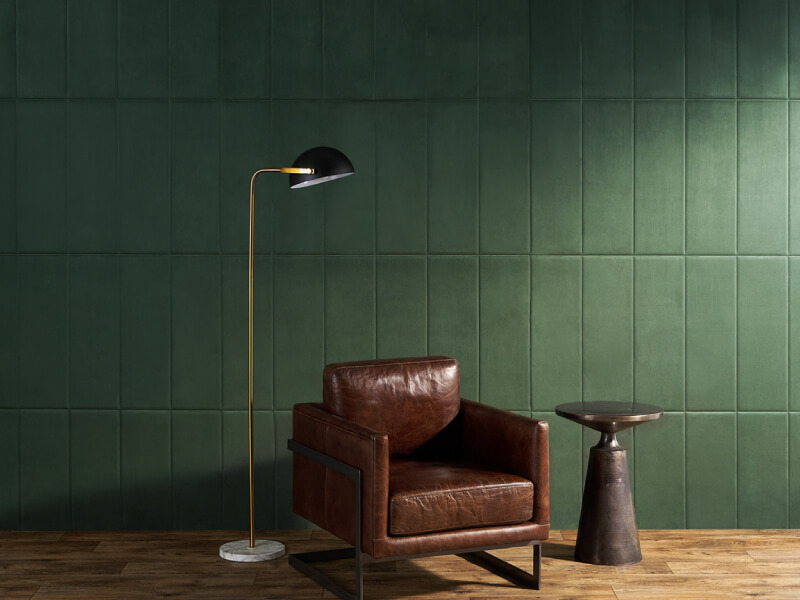
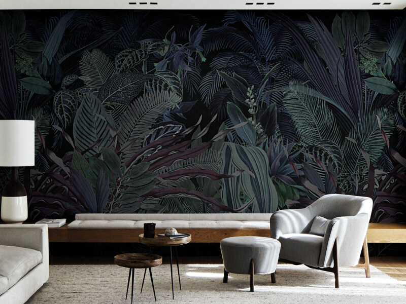
2. Muted greens

Muted Greens

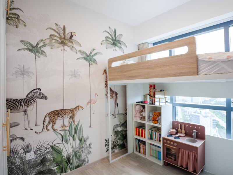
Green is another excellent choice for bedroom wallpaper, particularly in soft, muted tones like sage, mint, or olive. Green is associated with nature, growth, and renewal, making it an ideal colour for creating a restful and harmonious environment. A pale green wallpaper can help foster a sense of balance and tranquillity in your space, while darker greens can add a touch of elegance without overwhelming the room.

Pairing green wallpaper with natural wood furniture and leafy plants can enhance the room’s connection to nature, further promoting relaxation and a feeling of grounding.
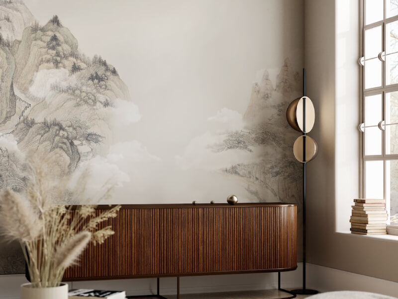
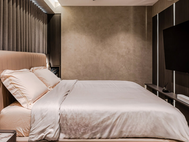
3. Warm neutrals

Warm Neutrals

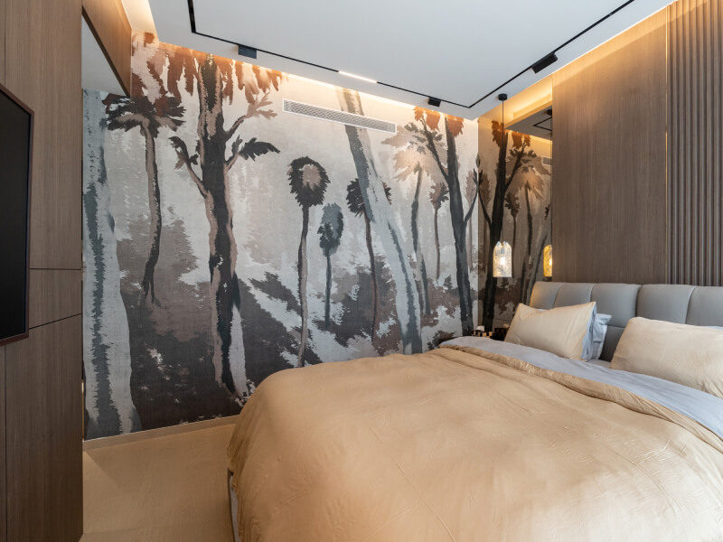
Neutral colours and interior designs such as beige, cream, and taupe are popular for their versatility and ability to complement a wide range of decor styles. Warm neutrals, in particular, can create a cosy and inviting atmosphere in the bedroom. These colours are unobtrusive and soft, allowing you to relax without distraction.

Choose wallpaper with subtle textures, such as linen-like patterns or gentle gradients, to add depth and dimension to the walls without sacrificing the calming effect. Warm neutrals can also act as a perfect backdrop for other design elements in your bedroom, such as soft textiles, warm lighting, and natural materials. 

4. Lavender and light purples

Lavender And Light Purples

Lavender and other light purple tones can introduce a sense of calm and luxury to a bedroom. Purple is often associated with royalty and creativity, but in its softer shades, it becomes a soothing colour that promotes relaxation and emotional balance. Light purples like lavender or lilac can make your bedroom feel more serene while adding a touch of personality and charm.

Pairing lavender wallpaper with white or light grey accents can keep the room from feeling too feminine or overwhelming, creating a balanced and peaceful environment that appeals to a wide range of tastes.
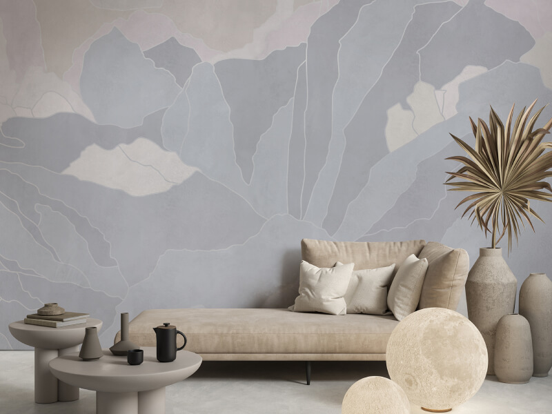
5. Soft greys

Soft Greys

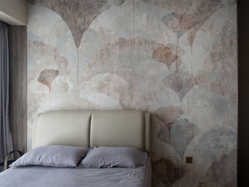
Gray is often seen as a neutral, sophisticated colour, and when used in the right shade, it can be incredibly calming. Soft, warm greys, in particular, are excellent for creating a peaceful bedroom environment. These shades are neither too cool nor too warm, offering a balanced backdrop that can help you relax.

A light grey wallpaper with a subtle texture or a barely-there pattern can add a touch of modern elegance to your bedroom while maintaining a sense of tranquillity. Avoid darker or overly cool greys, as they can make a space feel gloomy rather than soothing. 

6. Pale pinks

Pale Pinks

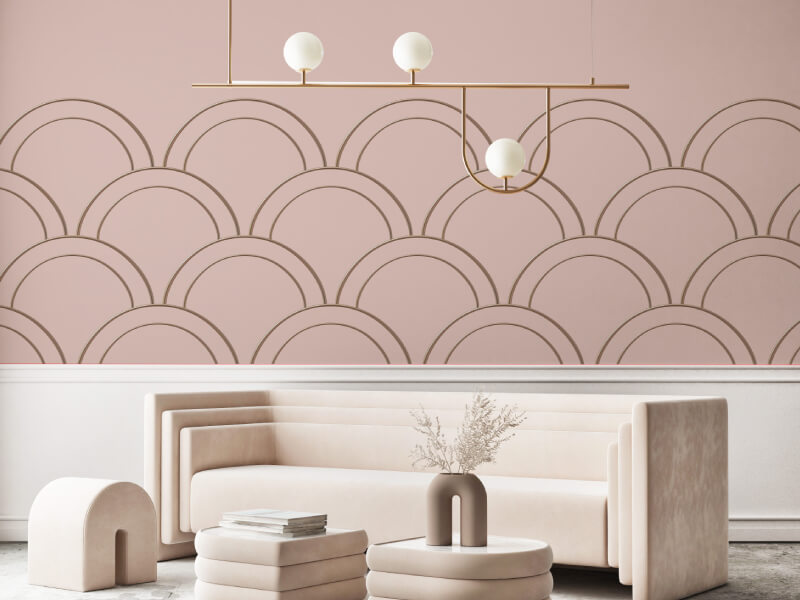
While pink may not be the first colour that comes to mind when thinking of a relaxing bedroom, pale and dusty pinks can create a soft and calming atmosphere. These shades evoke feelings of warmth, love, and comfort, making them perfect for a restful retreat. Soft pink wallpaper, particularly when paired with warm lighting and natural textures, can make your bedroom feel cosy without being too overwhelming or overly feminine.

Look for wallpapers in blush or rose tones with understated patterns or textures for a subtle yet soothing effect. 

Conclusion

When choosing wallpaper for a relaxing bedroom environment, it’s important to focus on colours that promote peace, tranquillity, and comfort. Soft blues, muted greens, warm neutrals, and pale purples are excellent choices that can help create a serene space for rest and relaxation. Earthy tones, pale pinks, and soft greys can also work wonders in transforming your bedroom into a calming retreat. Remember to choose patterns and textures that enhance the overall peaceful ambience, and balance your colour choices with the rest of your bedroom decor to create a harmonious and restful space.

Bringing Hotel Luxury Home: Wallpaper Ideas For An Upgrade

Bringing Hotel Luxury Home: Wallpaper Ideas For An Upgrade

Transforming your home into a luxurious retreat that echoes the sophistication of high-end hotels can be an exciting endeavour. One of the most impactful ways to achieve this is through wallpaper, especially when you partner with a reputable wallpaper supplier in Singapore. Wallpaper not only adds style but can also create a dramatic change in the ambience of your home.

Here are some wallpaper ideas to help you infuse your space with hotel luxury:

1. Go bold with statement patterns

Statement Patterns

Luxury hotels often feature bold, statement-making wallpaper patterns that become a focal point in the room. If you’re aiming to bring this grandeur into your home, consider opting for large-scale geometric designs, intricate florals, or dramatic motifs. These patterns can create an impressive visual impact and serve as a centrepiece in your room. For example, a feature wall adorned with a large, ornate pattern can transform an ordinary space into a sophisticated area reminiscent of a high-end hotel suite.

Statement wallpapers are available in various styles and colours, allowing you to choose a design that complements your existing decor while adding a touch of luxury. Metallic or velvet finishes can enhance the effect, offering a texture and sheen that elevate the overall aesthetic. Pair these wallpapers with minimalist furniture and accessories to keep the focus on the pattern and ensure that the room remains balanced and elegant.

2. Embrace metallic finishes

Metallic Finishes

Metallic wallpapers are a hallmark of luxurious interiors, reflecting light and adding a sense of glamour. Gold, silver, bronze, and other metallic finishes can create a shimmering effect that exudes sophistication. This type of wallpaper is particularly effective in spaces where you want to make a striking impression, such as dining rooms, entryways, or living rooms.

Metallic wallpapers come in a range of textures and styles, from subtle sheen to high-gloss finishes. For a refined look, choose wallpapers with delicate metallic accents that catch the light without overwhelming the space. If you prefer a more dramatic effect, opt for bold metallic patterns that can turn an entire wall into a statement piece. Incorporating metallic wallpaper can also help reflect light and make small rooms feel larger and more open, adding to the luxurious feel of your home.

3. Incorporate textured designs

Incorporate Textured Designs

Textured wallpapers add a tactile dimension to your interiors, creating depth and richness that is often associated with luxury. These wallpapers can mimic the look of high-end materials like silk, linen, or leather, adding a sense of opulence to your home. Textured designs include options such as embossed patterns, 3D effects, and fabrics with raised elements.

Textured wallpapers are ideal for creating a sophisticated atmosphere in any room. For example, a living room with a wallpaper that has a subtle linen texture can evoke the feel of a high-end hotel lounge. Alternatively, a bedroom with a faux leather wallpaper can provide a luxurious and cosy retreat. These textures not only enhance the visual appeal but also provide a sensory experience, making your home feel more inviting and elegant.

4. Experiment with dark, moody tones

Dark, Moody Tones

Dark, moody wallpaper shades can create a dramatic and cosy atmosphere, reminiscent of luxury hotel interiors. Colours such as deep navy, charcoal, emerald green, or rich burgundy can add a sense of sophistication and intimacy to your spaces. These hues are often used in luxury hotels to evoke a feeling of comfort and exclusivity.

When using dark tones, balance the richness of the wallpaper with lighter furnishings and decor to avoid overwhelming the room. Dark wallpaper works particularly well in spaces like bedrooms, where a cosy, intimate atmosphere is desired, or in dining rooms where the deeper tones can enhance the sense of luxury. Complement dark wallpaper with metallic accents, plush textiles, or mirrored surfaces to create a harmonious and upscale look.

5. Consider wallpaper with artistic prints

Artistic Prints

Art-inspired wallpapers offer a unique and sophisticated way to elevate your home’s decor. From abstract designs to reproductions of classic artworks, wallpaper with artistic prints can create a gallery-like atmosphere, adding a touch of personal style and sophistication to your space. Artistic prints can transform a room into a statement area, showcasing your tastes and preferences.

Choose wallpapers with designs that resonate with your style, whether you prefer bold, modern art or classic, timeless pieces. Artistic prints can be used to create feature walls, adding visual interest and a touch of elegance. For a cohesive look, pair these wallpapers with carefully selected furniture and accessories that complement the artwork. This approach not only enhances the luxury of your home but also creates a space that feels both unique and refined.

Conclusion

Incorporating these wallpaper ideas into your home can help you achieve a luxurious, hotel-inspired ambience. Whether you choose bold patterns, metallic finishes, textured designs, dark tones, or artistic prints, the right wallpaper can make a significant impact on your space. By carefully selecting and pairing these wallpapers with complementary decor elements, you can create an elegant and inviting environment that reflects the sophistication of high-end hotel interiors.

Explore various design blogs and resources for additional inspiration and ideas to transform your home into a luxurious retreat. With the right wallpaper choices, you can bring the allure of hotel luxury into your living space, creating a stylish and comfortable haven.

Using Wallpaper To Define Spaces In A Studio Apartment

Using Wallpaper To Define Spaces In A Studio Apartment

Maximising the potential of a studio apartment involves creating distinct zones that make the space feel more organised and functional. One versatile tool for achieving this is wallpaper. By strategically applying wallpaper, sourced from a reputable wallpaper supplier in Singapore, you can define areas, add character, and enhance the overall aesthetic of your studio apartment.

Here’s how you can effectively use wallpaper to define and elevate different spaces within your studio.

1. Establish a distinct sleeping area

Distinct Sleeping Area

Transforming a corner of your studio into a cosy sleeping nook can be achieved with wallpaper. By applying a distinctive wallpaper design to the wall behind your bed, you create a visual boundary that separates the sleeping area from the rest of the space. Choose a wallpaper that complements your bedding and personal style—whether it’s a soothing neutral or a bold print. This approach not only defines the area but also enhances the comfort and ambiance of your sleeping quarters. 

2. Differentiate the living and dining spaces

Differentiate Living And Dining Spaces

Defining separate areas for living and dining in a studio apartment can be done with creative wallpaper use. Apply different wallpaper designs or colours to the walls of each zone to create a clear visual distinction. For example, you might use a calming pattern or solid colour in the living area, while opting for a more vibrant or textured wallpaper in the dining space. This not only organises your studio but also adds depth and visual interest, making each area feel distinct yet cohesive.

3. Highlight a Functional Workspace

Incorporating a workspace or home office in a studio apartment can be challenging, but wallpaper can help you create a defined and inspiring area. Apply wallpaper to the wall behind your desk or workspace to set it apart from the rest of the room. Choose a design that enhances productivity and complements the overall decor. Whether you prefer a subtle texture or a bold pattern, this technique helps to visually separate the workspace while adding a personal touch. 

4. Emphasise architectural features

Architectural Features

Studio apartments often have unique architectural elements such as exposed brick walls or distinctive mouldings. Use wallpaper to highlight these features and draw attention to them. For instance, you can contrast a sleek, modern wallpaper with an exposed brick wall to create a striking visual effect. This approach not only brings attention to the architectural details but also adds a dynamic element to your studio’s decor.

5. Define small areas and add visual interest

Small Areas Add Visual Interest

Wallpaper can also be used in smaller areas of your studio to create visual interest and define specific zones. Apply wallpaper to spaces like the entryway, above the kitchen counter, or within alcoves to add character and make these areas feel integrated into the overall design. This technique helps in enhancing the functionality of these small spaces while ensuring they contribute to the cohesive look of your studio apartment.

Conclusion 

Using wallpaper to define spaces in a studio apartment is an effective way to enhance functionality and style. By strategically applying wallpaper, you can create distinct areas for sleeping, living, dining, and working, while also highlighting architectural features and adding visual interest. Whether you’re looking to establish clear boundaries or simply add personality to your studio, wallpaper offers a versatile solution that can transform your compact living space into a stylish and organised home.

Colour Psychology: Choosing The Right Wallpaper For Your Mood

Colour Psychology: Choosing The Right Wallpaper For Your Mood

Choosing the right wallpaper for your home is more than just a design decision; it’s a choice that can significantly influence your mood and overall well-being. Colour psychology, the study of how hues affect human behaviour, can be a powerful tool in creating the desired ambience in your living space.

This article explores the impact of different colours on your mood and provides guidance on selecting the perfect wallpaper to foster a positive atmosphere in your home.

The science of colour psychology

Colour psychology is based on the premise that colours can evoke specific emotions and responses in people. While reactions to colours can be subjective and influenced by personal experiences, certain colours tend to evoke similar responses in many individuals. Understanding these associations can help you make informed decisions when decorating your home. For those looking for quality options, consulting a wallpaper supplier in Singapore can provide additional insights and selections tailored to your needs.

Warm colours: Energising and Invigorating

Warm Colours

Warm colours like red, orange, and yellow are known for their energising and stimulating effects. These hues can make a room feel more inviting and vibrant.

  • Red: Red is a powerful colour associated with passion, excitement, and energy. It can increase heart rate and stimulate the senses, making it ideal for social spaces like living rooms and dining areas. However, too much red can be overwhelming, so it’s best used as an accent colour or in moderation.
  • Orange: Orange combines the energy of red with the happiness of yellow. It is associated with enthusiasm, creativity, and warmth. Orange can be a great choice for playrooms, home offices, or kitchens, where a lively and stimulating environment is desired.
  • Yellow: Yellow is the colour of sunshine and happiness. It promotes a cheerful and optimistic atmosphere, making it perfect for kitchens, bathrooms, and hallways. However, like red, too much yellow can be overpowering, so balance it with neutral tones.

Cool colours: Calming and Relaxing

Cool Colours

Cool colours such as blue, green, and purple are known for their calming and soothing effects. These hues can help create a tranquil and peaceful environment, perfect for relaxation.

  • Blue: Blue is often related with calmness, serenity, and stability. It can lower blood pressure and create a sense of tranquillity, making it ideal for bedrooms and bathrooms. Lighter shades of blue can make a room feel airy and spacious, while darker shades can add depth and sophistication.
  • Green: Green represents nature and is linked to feelings of balance, harmony, and renewal. It is a versatile colour that works well in almost any room, particularly in spaces where you want to promote relaxation and comfort, such as living rooms and bedrooms.
  • Purple: Purple is associated with luxury, creativity, and introspection. Lighter shades like lavender can evoke calmness and are perfect for bedrooms, while darker shades like plum can add a touch of elegance and sophistication to living spaces.

Neutral colours: Versatile and Timeless

Neutral Colours

Neutral colours such as white, grey, and beige provide a versatile backdrop that can complement any colour scheme. Neutral interior designs are timeless and can create a sense of balance and simplicity in your home.

  • White: White is associated with cleanliness, simplicity, and purity. It can make a room feel larger and more open, creating a blank canvas for other design elements. White is perfect for any room, but it is especially popular in kitchens and bathrooms.
  • Grey: Grey is a sophisticated and versatile colour that can create a calming and balanced environment. It works well in modern and minimalist designs and can be paired with almost any other colour. Grey is a great choice for living rooms, bedrooms, and offices.
  • Beige: Beige is a warm and inviting neutral colour that promotes a sense of calm and comfort. It is an excellent choice for living rooms, bedrooms, and hallways, providing a soft and soothing backdrop that works well with various design styles.

Selecting the right wallpaper for each room


Right Wallpaper

When choosing wallpaper, consider the primary function of the room and the mood you want to create. Here are some tips for selecting the right wallpaper based on colour psychology:

  • Living room: Opt for warm colours like red or orange to create an inviting and social atmosphere. If you prefer a more relaxing environment, consider cooler tones like blue or green.
  • Bedroom: Choose calming colours like blue, green, or lavender to promote relaxation and restful sleep. Neutral tones like grey or beige can also create a serene and tranquil space.
  • Kitchen: Bright and cheerful colours like yellow or orange can make your kitchen feel lively and energetic. If you prefer a more modern look, consider white or grey.
  • Bathroom: Light blues and greens can create a spa-like, calming environment. White is also a popular choice for bathrooms, as it promotes a sense of cleanliness and simplicity.
  • Home office: Opt for colours that stimulate creativity and focus, such as green or blue. Orange can also be a good choice if you want to create a more energetic and vibrant workspace.

Conclusion

Colour psychology can be a powerful tool in creating the perfect ambience in your home. Whether you’re looking to energise your living room, create a calming bedroom retreat, or design a cheerful kitchen, the right colour can make all the difference. Use this guide to help you select the perfect wallpaper that not only enhances your décor but also improves your overall well-being.

4 Creative Ways To Use Wallpaper To Create A Cosy Reading Nook

4 Creative Ways To Use Wallpaper To Create A Cosy Reading Nook

Creating a cosy reading nook can be one of the most delightful and fulfilling home improvement projects. A dedicated space for enjoying your favourite books and escaping into literary worlds is a luxury that can be achieved with a few creative touches. Wallpaper in Singapore is an excellent tool for transforming an ordinary corner into a warm and inviting reading haven.

Here are four creative ways to use wallpaper to create a cosy reading nook.

1. Feature wall with bold patterns

Feature Wall

A feature wall can serve as the focal point of your reading nook, setting the mood and adding a touch of personality. Choose a bold, eye-catching wallpaper pattern to create a statement. Floral designs, geometric shapes, or even a mural can add depth and interest to your nook. Selecting the right wall is crucial; the wall behind your reading chair or the one that faces the entrance to your nook is an ideal spot for a feature wall. Ensure the wallpaper pattern aligns with the overall theme of your home decor. For a more cohesive look, match the colours in the wallpaper with other elements in the room, such as throw pillows, blankets, or rugs. If the wallpaper is particularly vibrant or busy, balance it out with simpler, solid-coloured furnishings and decor. This prevents the space from feeling too overwhelming.

A bold feature wall not only defines the space but also makes your reading nook a visual delight, encouraging you to spend more time there.

2. Creating texture with wallpaper

Wallpaper

Textures play a crucial role in creating a cosy atmosphere. Textured paint or wallpaper can mimic the look and feel of materials like fabric, wood, or stone, adding warmth and a tactile dimension to your reading nook. Look for wallpapers with subtle textures, such as linen, grasscloth, or faux wood. These materials add a layer of cosiness without overpowering the space. Enhance the texture of the wallpaper by pairing it with soft furnishings like plush cushions, knitted throws, and a comfortable reading chair. The combination of textures will create a snug, inviting environment. Use lighting strategically to highlight the texture of the wallpaper. Soft, warm lighting can accentuate the depth and dimension of the textured wall, making the space feel even cosier.

Textured wallpaper brings a unique, tactile quality to your reading nook, making it a comforting retreat from the rest of the house.

3. Wallpapering the ceiling

Wallpapering Ceiling

Often overlooked, the ceiling can be an excellent canvas for wallpaper. This unconventional approach can add a surprising element of charm to your reading nook, making it feel more intimate and enclosed. Choose a wallpaper design that complements the walls and overall colour scheme of your nook. Soft patterns or subtle prints work well for ceilings, preventing the space from feeling too enclosed. Wallpapering the ceiling can create a canopy-like effect, especially if you choose patterns that evoke nature, like leaves or clouds. This adds to the cosy, sheltered feeling of your nook.

To enhance this effect, consider pairing your ceiling wallpaper with complementary vinyl flooring. Install a statement light fixture or a series of small pendant lights to draw attention to the ceiling. The light will highlight the wallpaper, adding depth and interest to the space.

A wallpapered ceiling can turn your reading nook into a magical, whimsical space that feels like a world of its own.

4. Mixing and matching wallpapers

Matching Wallpapers

For a truly unique reading nook, consider mixing and matching different wallpaper patterns. This eclectic approach can create a vibrant, personalised space that reflects your personality and style. Start by selecting a cohesive colour palette that ties the different wallpapers together. This ensures that, despite the variety, the overall look remains harmonious. Combine bold patterns with solid colours or simpler designs. For example, you could use a floral wallpaper on one wall and a coordinating stripe or geometric pattern on another. To avoid overwhelming the space, keep the rest of the decor simple. Choose neutral or complementary colours for furniture and accessories to balance the busy wallpaper designs.

Mixing and matching wallpapers can make your reading nook an exciting, dynamic space that feels both cosy and creatively stimulating.

Final touches

Once you’ve transformed your reading nook with these wallpaper techniques, add the final touches to enhance the cosiness. Comfortable seating is essential for long reading sessions; a plush armchair or a cosy daybed will do the trick. Soft lighting is key to creating a warm, inviting glow; consider floor lamps, table lamps, or even fairy lights. Decorate with personal items like framed photos, favourite books, and cherished knick-knacks to make the space truly yours.

Creating a cosy reading nook with wallpaper is a wonderful way to personalise your home and carve out a special space just for you. With these creative ideas, you can transform any corner into a welcoming retreat where you can unwind and escape into the pages of a good book.