Home with Wallhub, Justin & Meilin

Home with Wallhub Wallpaper Singapore Projects

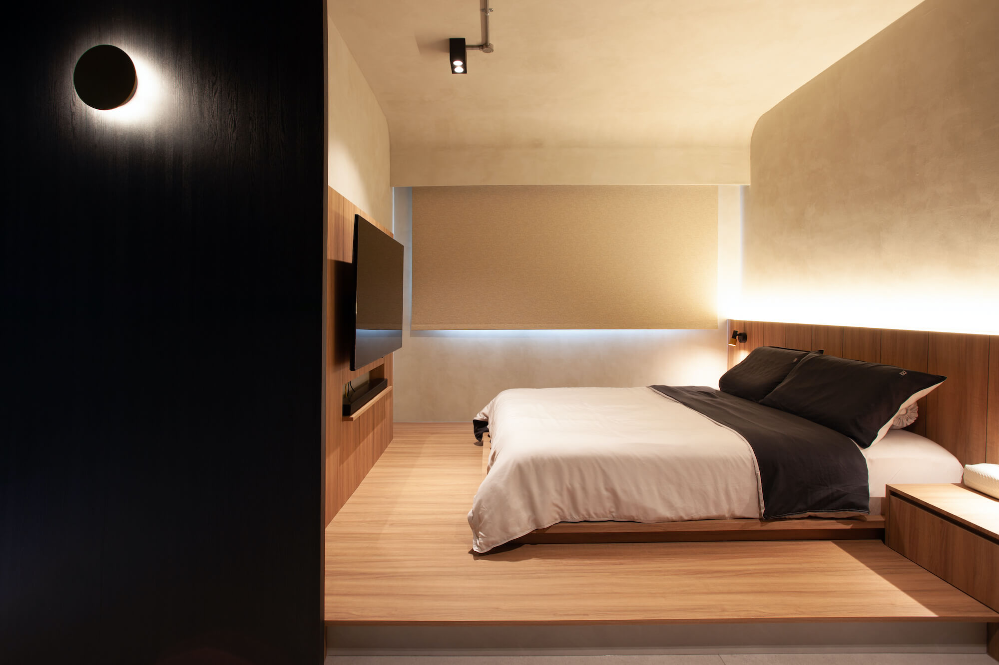
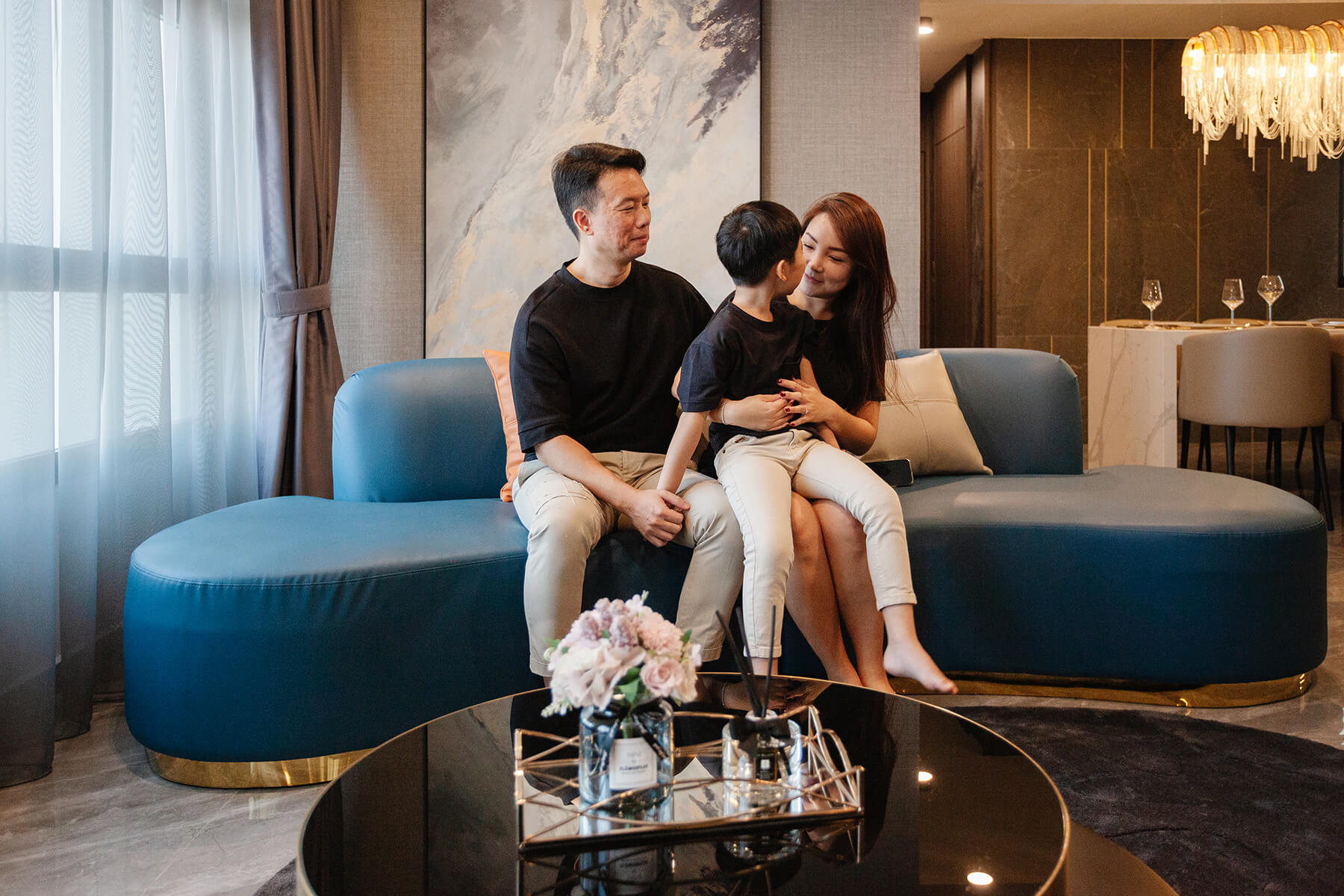
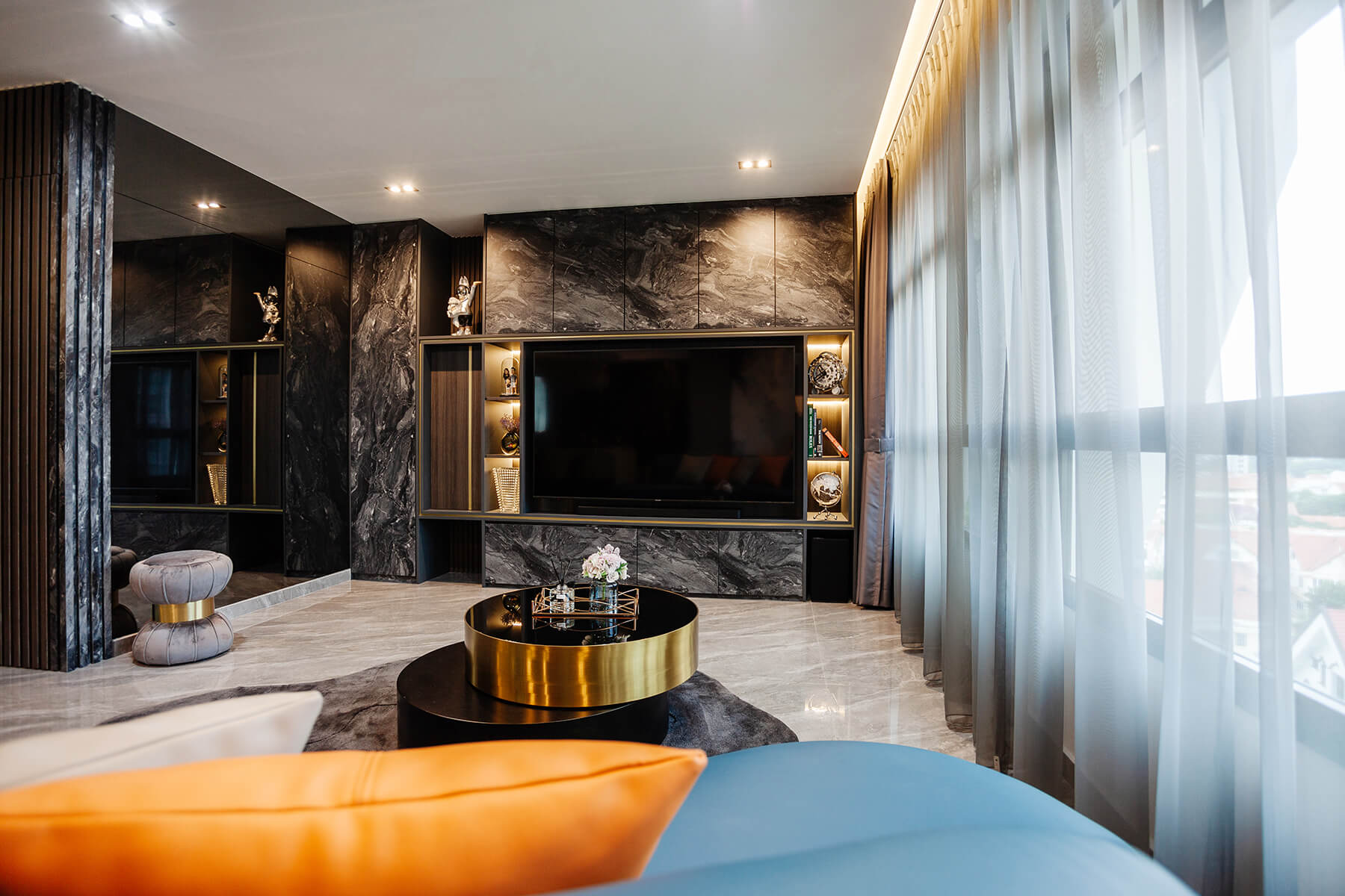
Statement pieces, dark woods & beautiful glimmers of gold are not the only features that make this modern luxury home shine. It is the care and thought of every detail that echoes the personality of Justin & Meilin, while their vision of a home to call their own comes to life. 

Read on for a peek into their home!
Home with Wallhub Wallpaper Singapore Projects

Wallhub: Hi Justin & Meilin, Thank you for having us at your home, it is gorgeous! Would you share with us your inspiration for your home? 

Justin: We have always loved the idea of having a home that is like a hotel. One that feels inviting, cosy, timeless and luxurious. We have been to a friend’s home that introduced dark colours in their spaces, and we felt that the atmosphere resonated with how we would like our home to feel.

Meilin: From thereon, we searched the internet for inspiration, as well as started looking for an interior designer to help us make it happen. We are so glad to have found one who understood what we are looking for and shared with us many wonderful ideas and tips. 
Home with Wallhub Wallpaper Singapore Projects

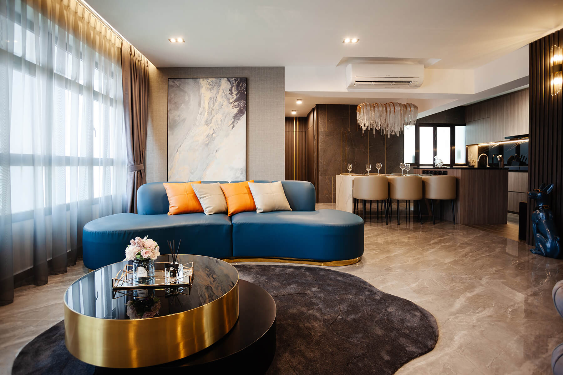
Wallhub: Love the colour palette you have, and that pop of blue from your curved sofa is refreshing! 

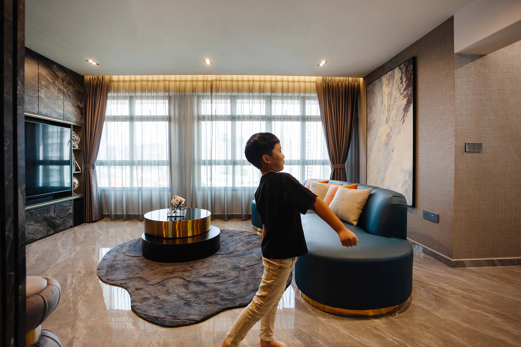
Meilin: Thank you! Both Justin and I did not fancy the conventional L-shape sofa. We think that it would make the living room feel very rigid and boxy. That leads us to pick a curved one instead. Against the backdrop of a grey-taupe vinyl wallpaper from Wallhub, not only does the sofa add a fun element to the room, we feel this shade of blue invigorates and compliments it.
Home with Wallhub Wallpaper Singapore Projects

Wallhub: Indeed, it does! How did you come about selecting your wallpapers?

Justin: We feel that the modern luxury interior style anchors on the idea that white painted walls should be avoided (or kept to a minimum) and wallpaper would elevate the look, just like in the hotels. With the help of our ID’s renderings, we were able to share them with Wallhub to find the designs to match our interiors. With the help of Wallhub’s sales consultant, we were able to do so effortlessly. 
Home with Wallhub Wallpaper Singapore Projects

Wallhub: Your wallcoverings look great, would you tell us more about your experience with Wallhub?

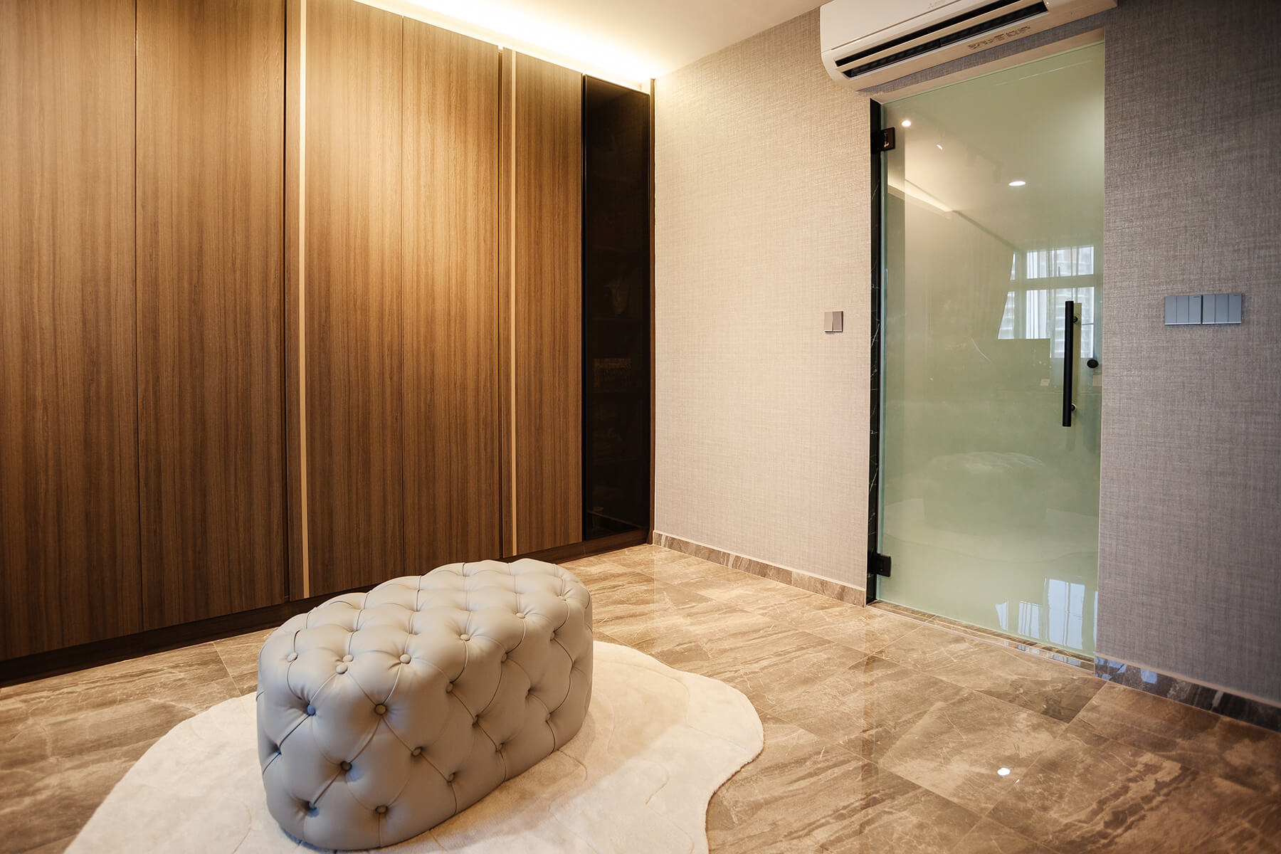
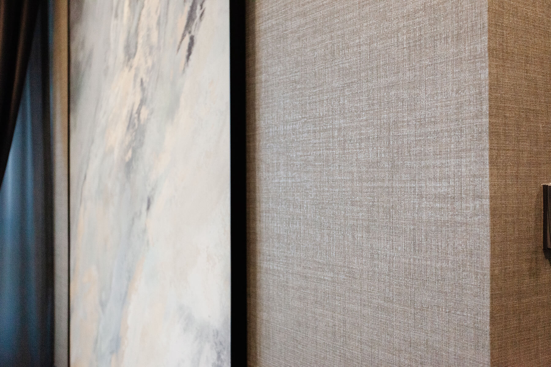
Justin: We first went to Wallhub’s showroom with our renderings and floor plan, with no clue on what we want exactly. We shared our ideas and concerns – like wanting a moody interior without it being too dark – and learnt that not all wallpapers are made the same. 

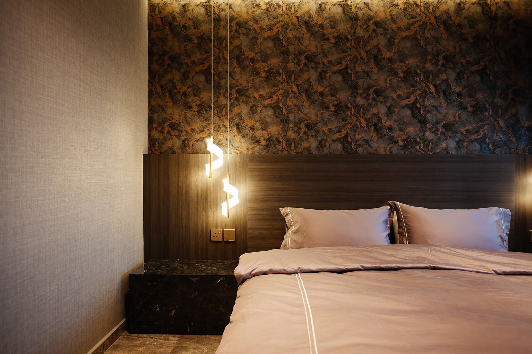
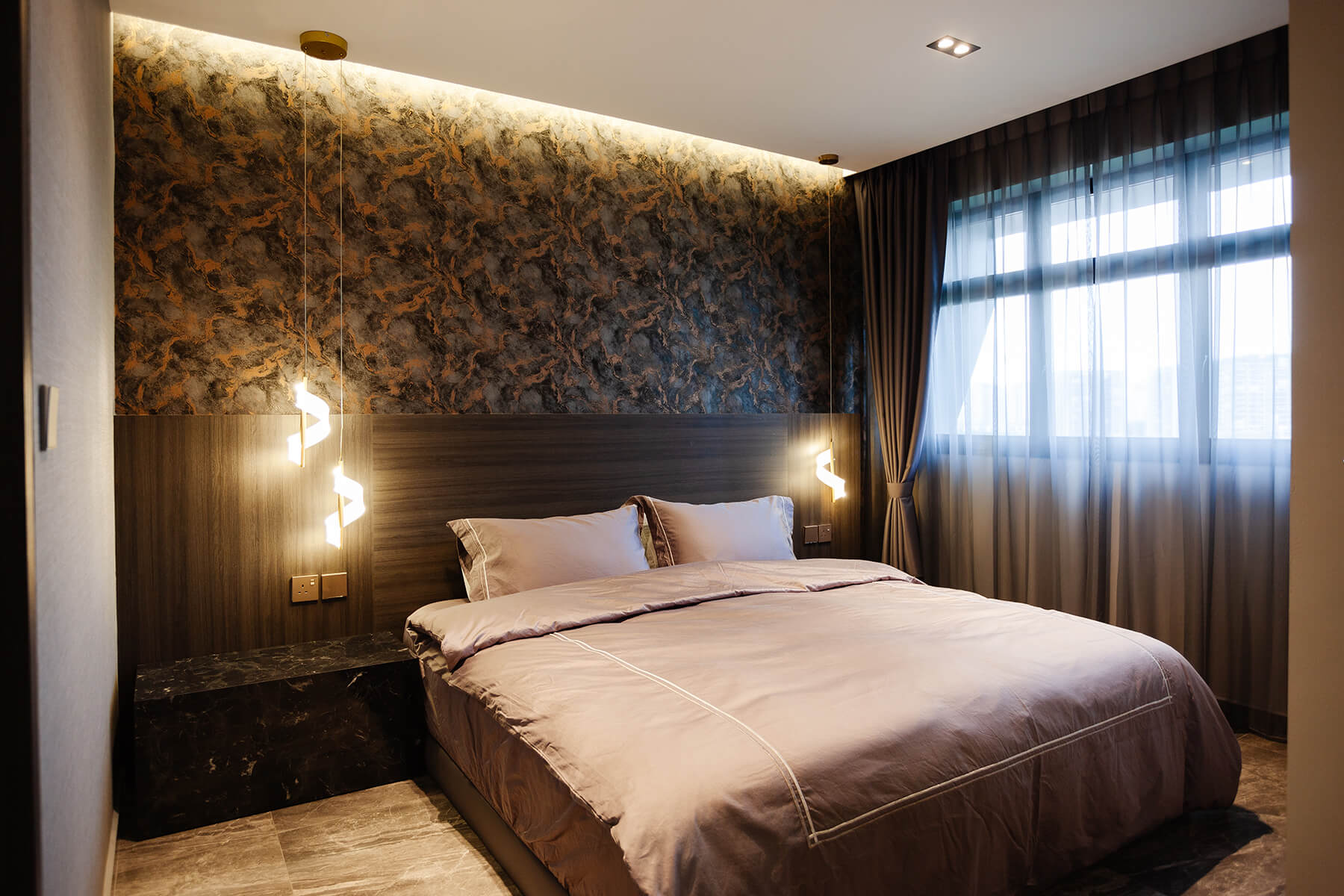
With Wallhub’s wide variety of selection and professional advice, we decided to go with the vinyl wallpaper on our sofa wall and corridor, and their Turkish wallpaper as our bed-head feature wall. The whole process was insightful and enjoyable. The installers are very professional and it makes the process very much effortless.
Home with Wallhub Wallpaper Singapore Projects

Home with Wallhub Wallpaper Singapore Projects

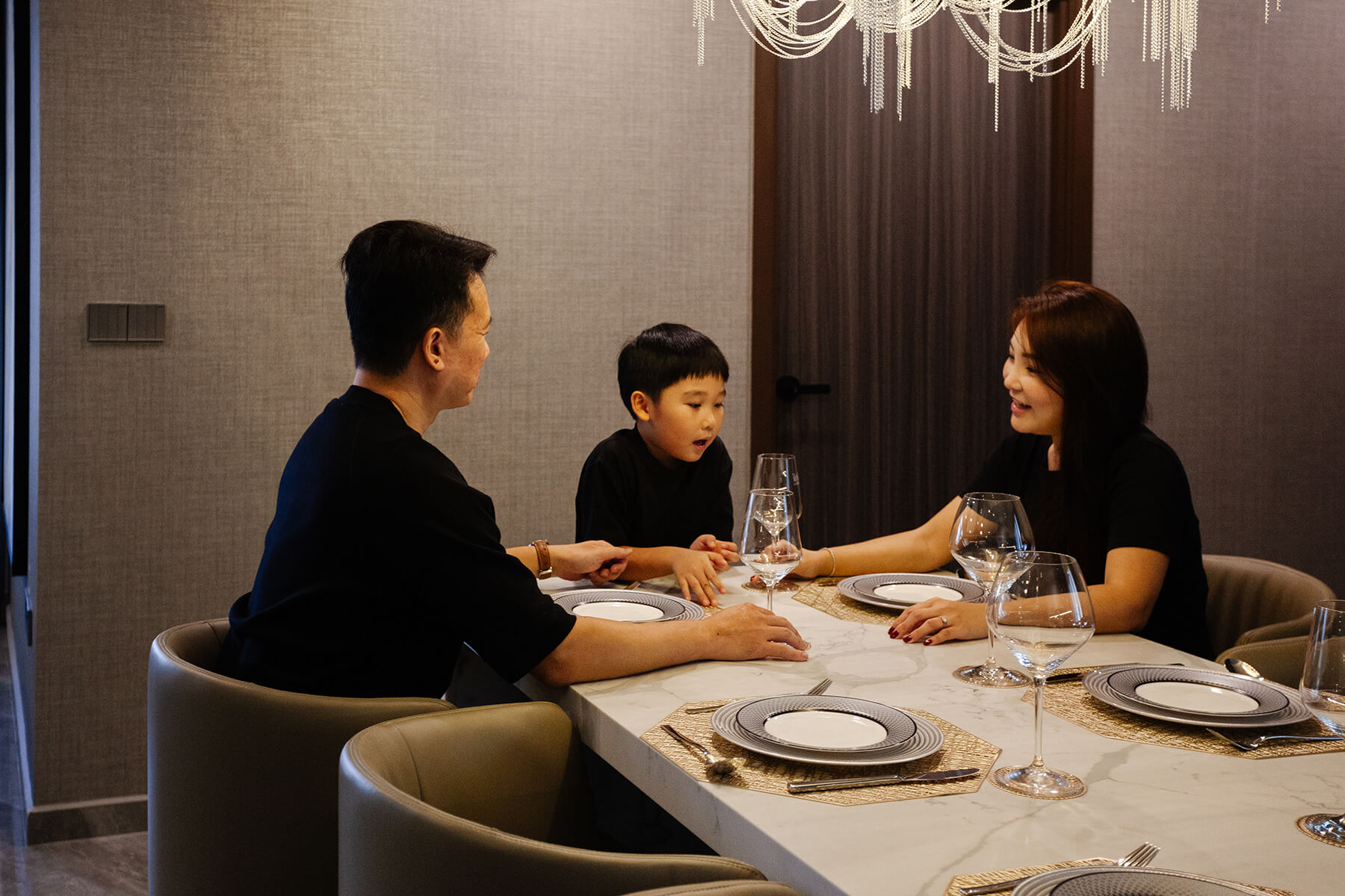
Meilin: We have a cheeky and playful boy, and Wallhub recommended the vinyl wallpaper collection for its resilience. It is one of the best choices we have made. Our little one couldn’t stop touching the wallpaper and it is holding up really well. It looked great and we even placed another order for our bedroom’s general walls.
Home with Wallhub Wallpaper Singapore Projects

Wallhub: We are glad to know that! With every room of yours being so stunning, if you really have got to pick, which is your favourite, and why? 

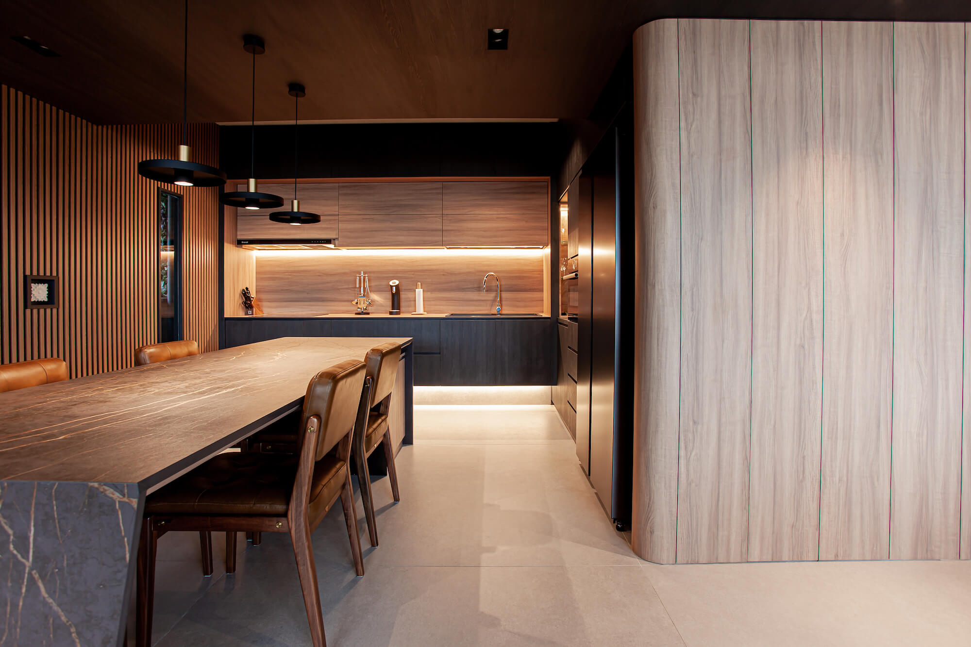
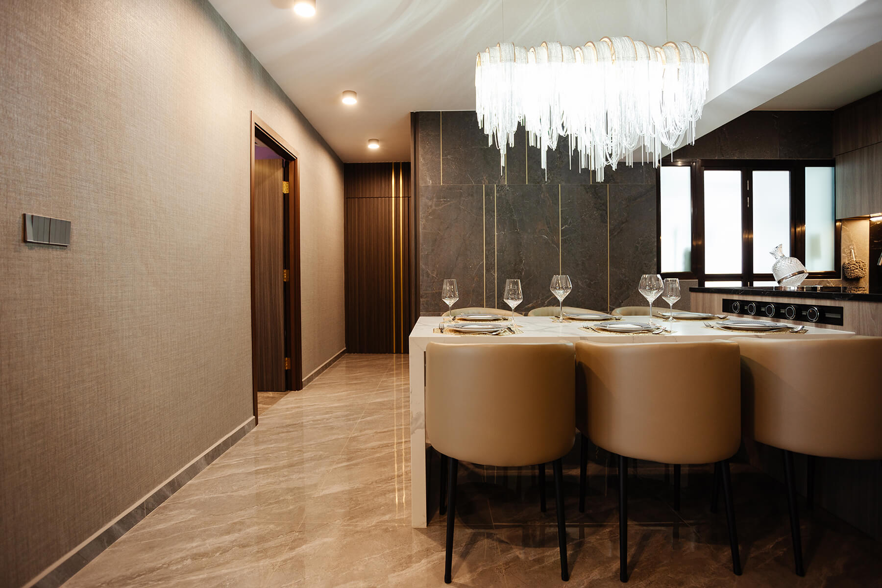
Meilin: That would have to be our dining area. It is the go-to spot where we have meals together every day as a family, where my son and I spend time together going through his homework and drawings, and where Justin enjoys a tipple while we chat. 

Justin: We also like how the dining table is integrated with the kitchen island, maximising the space we have. We don’t do much heavy cooking, so an open kitchen works great for us.
Home with Wallhub Wallpaper Singapore Projects

Wallhub: Your dining area is one of our favourites as well. Thank you for taking the time to share your home with us, Justin & Meilin. Before we go, would you have any tips for homeowners who would like to create a home like yours? 

Meilin: Justin would say no white walls (laughs), and I, to find pieces that speak uniquely to you. Take the time to do your research. There are a lot of options and beautiful pieces out there, so keep looking and start creating your interior inspiration boards.

For more peeks into the lovely spaces of #homewithwallhub, head on over here!
Home with Wallhub & Ar. Kelvin Wang

Home with Wallhub Wallpaper Singapore Projects

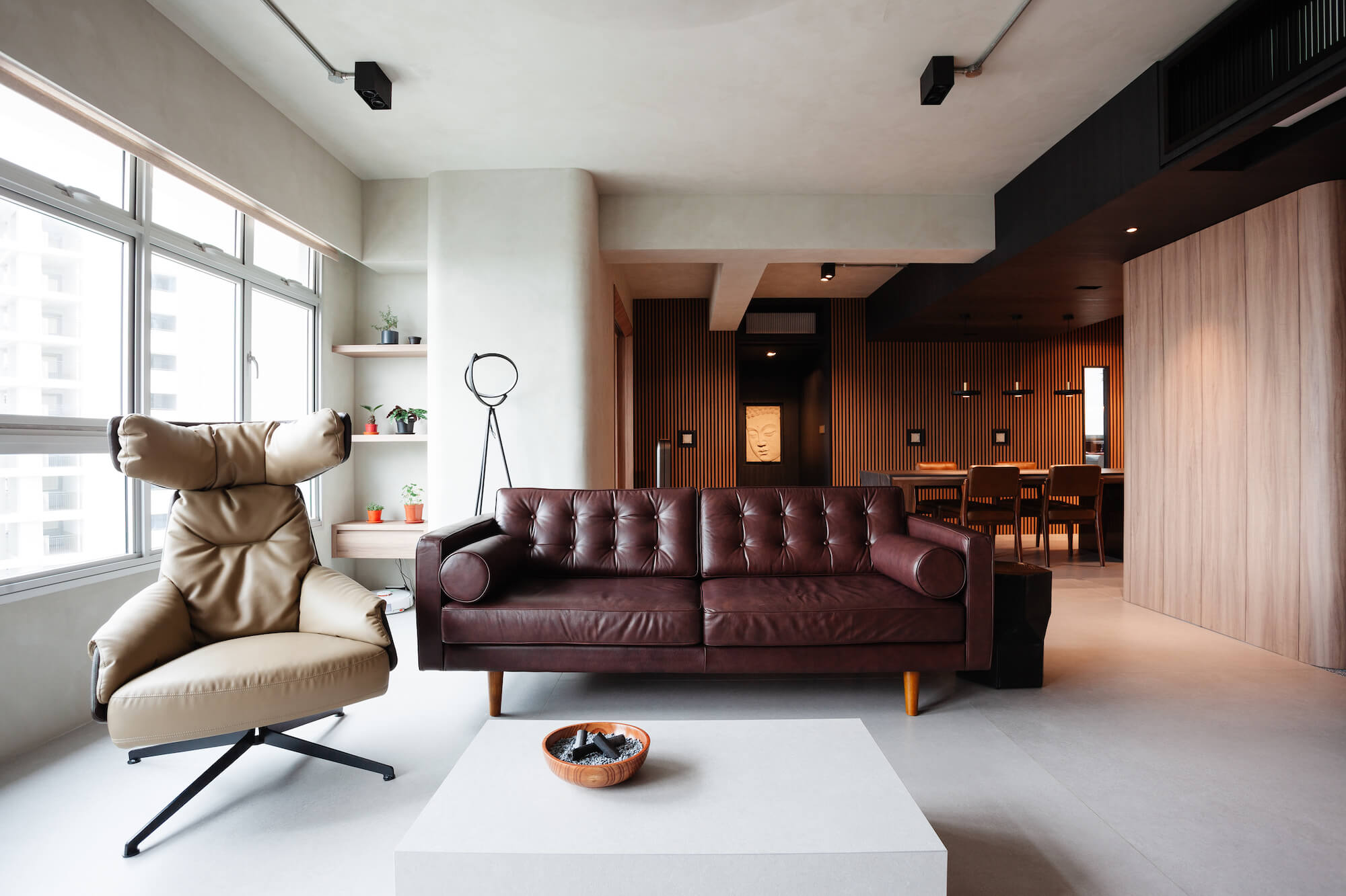
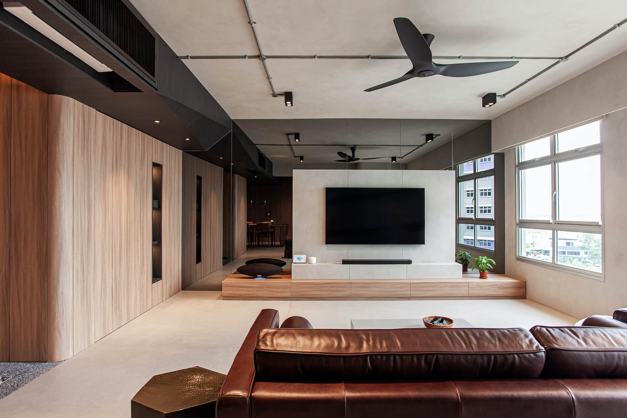
It may seem simple, but getting the Scandinavian Brutalism interior looking elegant is truly a balancing act. If you introduce too many concrete elements, you tip the scale towards creating a cold, hard space, like that of a prison cell. An excessive amount of wood and you find yourself losing the touch of the charming raw and honest imperfections.

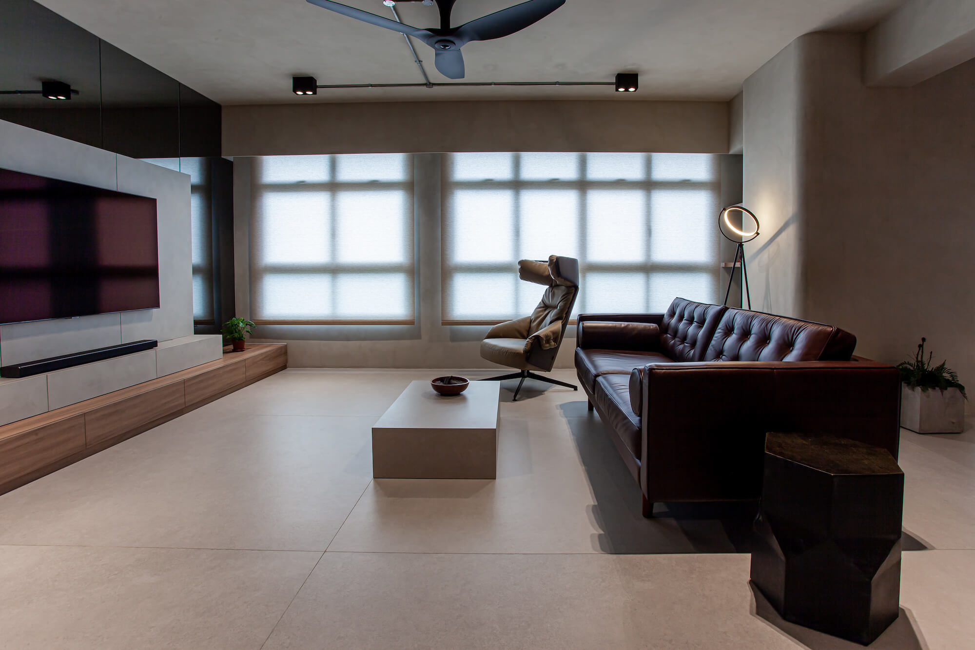
With their palette of concrete and wood elements, statement pieces, and ambient lighting, Architect Kelvin Wang and his wife, Jocelyn, have definitely found the perfect balance in designing, detailing, and styling their home, “…brutally elegant…”

Take a peek into their beautiful home as Kelvin shares their design thoughts and tips with us. Read on!

Home with Wallhub Wallpaper Singapore Projects

Wallhub: Hi Kelvin! Congratulations on your new home, it is beautiful. Would you share with us a little about yourself and your design philosophy as an architect? 

Kelvin: I am a locally registered Architect practising in a boutique architecture firm. It is my strong belief that a good design must not only be able to stand the test of time but should also encompass thoughtful details that contribute to the greater whole. A good design does not necessarily need to be complicated – sophistication can be achieved through the manipulation and use of simple material palettes and forms. 

Home with Wallhub Wallpaper Singapore Projects

Wallhub: What is your design inspiration and approach for your home? 

Kelvin: The design takes inspiration mainly from Brutalist architecture with the insertion of some Scandinavian characteristics. Jocelyn and myself are both fascinated with the monolithic and volumetric articulation of Brutalist architecture. We find beauty in the honesty of patinaed textures and how imperfections are shamelessly embraced. From the onset, we wanted to have those qualities incorporated into our home design. But of course, Brutalism in its pure self can be rather… erm brutal – lacking some warmth and sense of cosiness. To address this, we took some inspiration cues from Scandinavian design and incorporated elements of wood and green to tame the harshness. 

Home with Wallhub Wallpaper Singapore Projects

Wallhub: We love the attention to detail of your spaces. What were your key considerations/challenges when designing this place? 

Kelvin: One of the most challenging aspects of designing our home was to consistently maintain the discipline to curate and keep the design in control. Many ideas have accumulated through my years of working as an architect, an interior designer and even a contractor – there were temptations to insert some of those previously rejected “what-I-think-are-great” ideas into the design. It was therefore necessary to sieve out only the good and compatible ideas and make sure they fit into the grand scheme of things.  

Home with Wallhub Wallpaper Singapore Projects

Wallhub: If you have got to pick your favourite part of the house, which would it be and why? 

Kelvin: We are absolutely satisfied with how seamlessly the Living, Dining and Study has fused into a single large communal space. The Dining island has become the heart of the activity space. One moment we could be both eating on it, the next we could be working, an hour later we could be playing host to family and friends. When needed, the open layout of the communal space also allows us to take “small, private break-aways” into the Study and Living from the Dining but yet still be within visual reach of each other. 

Home with Wallhub Wallpaper Singapore Projects

Wallhub: We are loving how you have the Strato® Textured Paint in SCT 309 – Ashes Grey, on your walls as well as your ceiling. How did you come about to decide on the cement paint as well as the colour? 

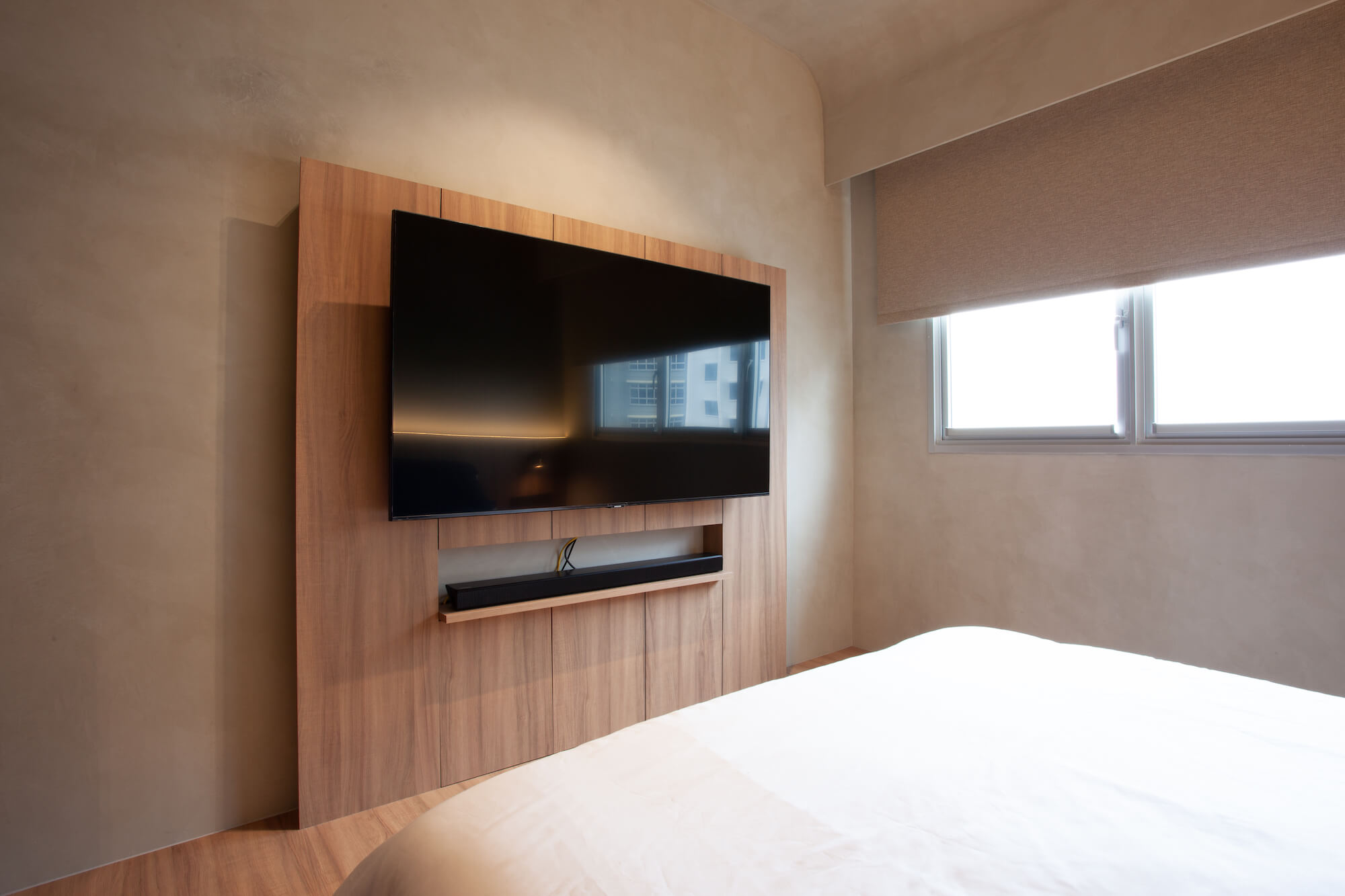
Kelvin: The initial plan was to go for cement plaster. However, after considering the usage of air-conditioning, and the application across different materials (concrete, brick, plasterboard), it is inevitable that cracking and chipping of the cement plaster will occur. It is hard to determine and control the fluctuations in humidity and different rates of contraction/expansion. Extensive prep work on the existing surfaces and additional cost will unavoidably be required. Hence, we decided to finish the walls and ceiling in cement-look textured paint.

SCT-309 was chosen as it closely matches the tile and laminate tones that we have selected – allowing a contiguous and homogeneous cement-look from floor to wall and ceiling. Not only is the Strato® Textured Paint crack resistant, but it is also low in VOC, formaldehyde & lead free. It would also be a breeze to care for in comparison to actual cement plaster over time.

Home with Wallhub Wallpaper Singapore Projects

Wallhub: We are glad that you are loving the textured paint as much as we do! Do share with us your experience with Wallhub.

Kelvin: There is a large variety of wall finishes to select from. Cher, my sales consultant, was very responsive and helpful from the selection phase through to post-completion. The installers are very professional and take the utmost pride in their work.  

Home with Wallhub Wallpaper Singapore Projects

Wallhub: Thank you so much for taking the time to show us your home and for sharing, Kelvin! Would you have any tips for homeowners who would like to achieve this interior look? 

Kelvin: When it comes to materiality, it is very easy to go overboard with colours – curate and control your material palette. Do not go overboard with splashing different colours everywhere. Think about lighting, both natural and artificial. They play an important role in creating different spatial experiences during different times of the day. 


View more of Ar. Kelvin’s works here and for more peeks into the lovely spaces of #homewithwallhub, head on over here!
 

Home with Wallhub & Zoe

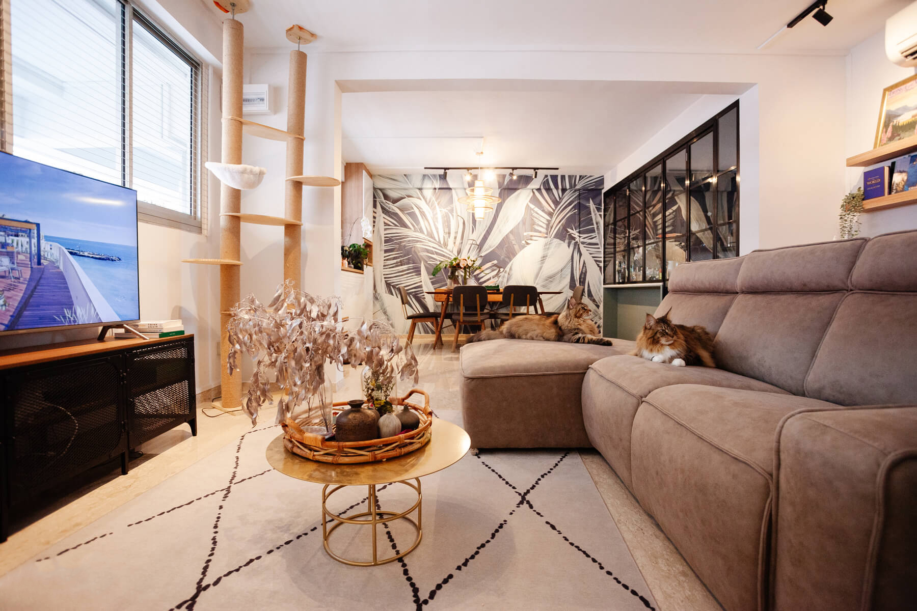
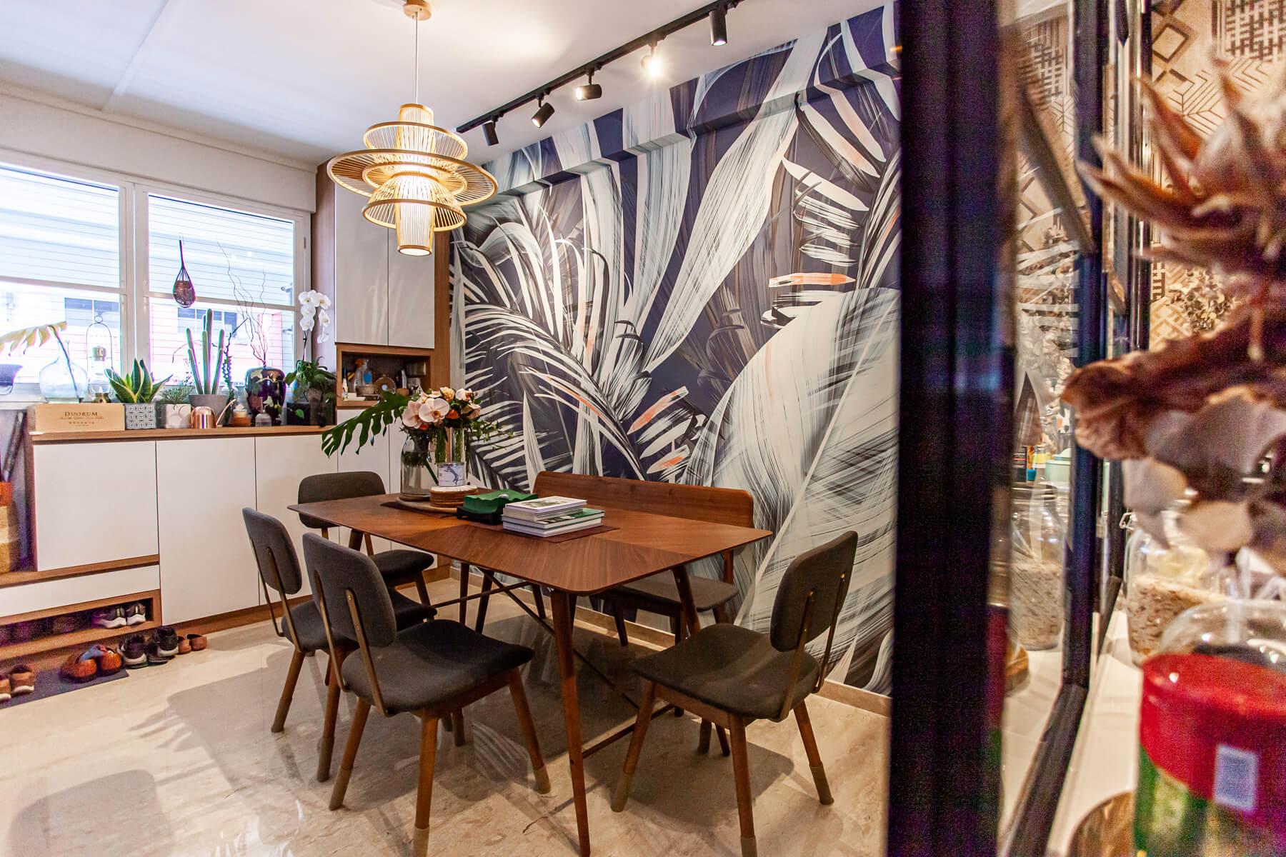
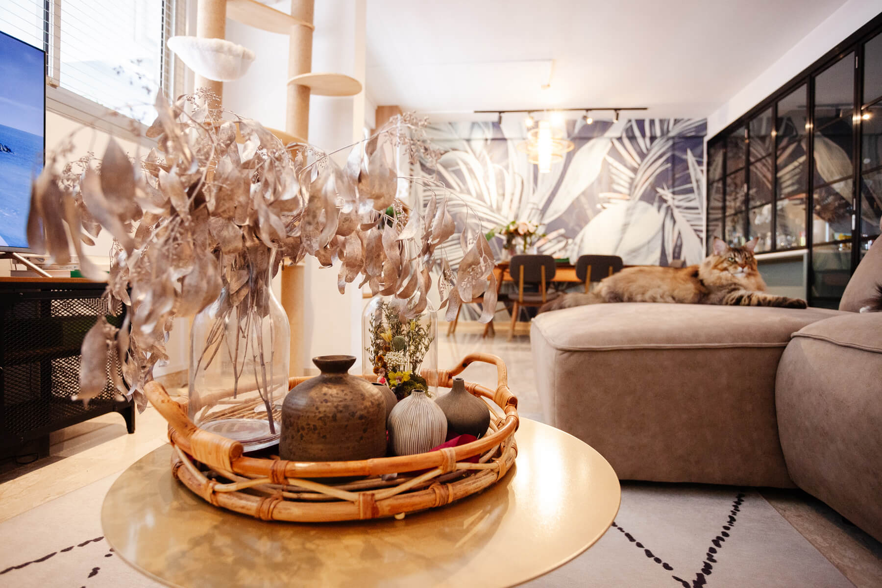
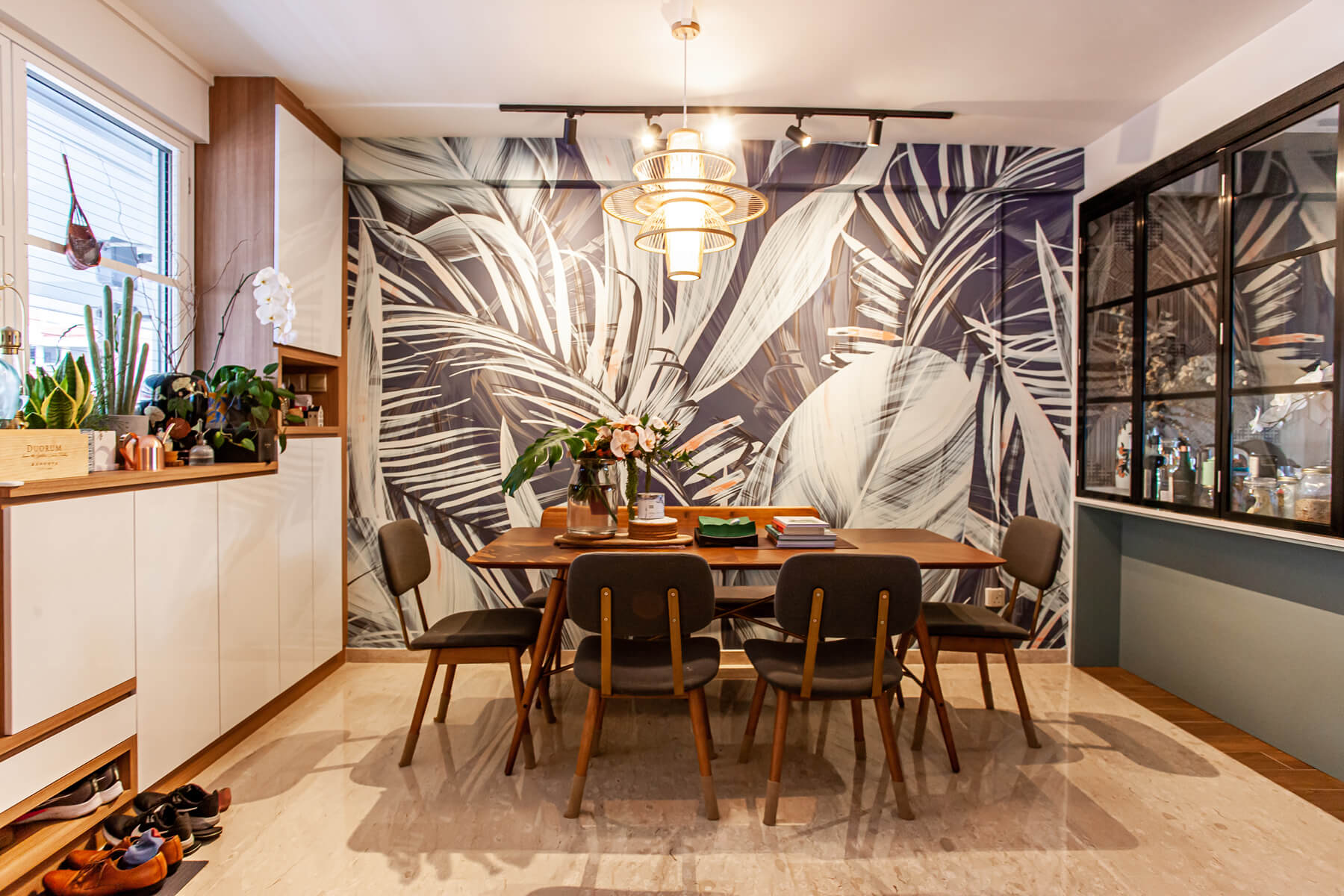
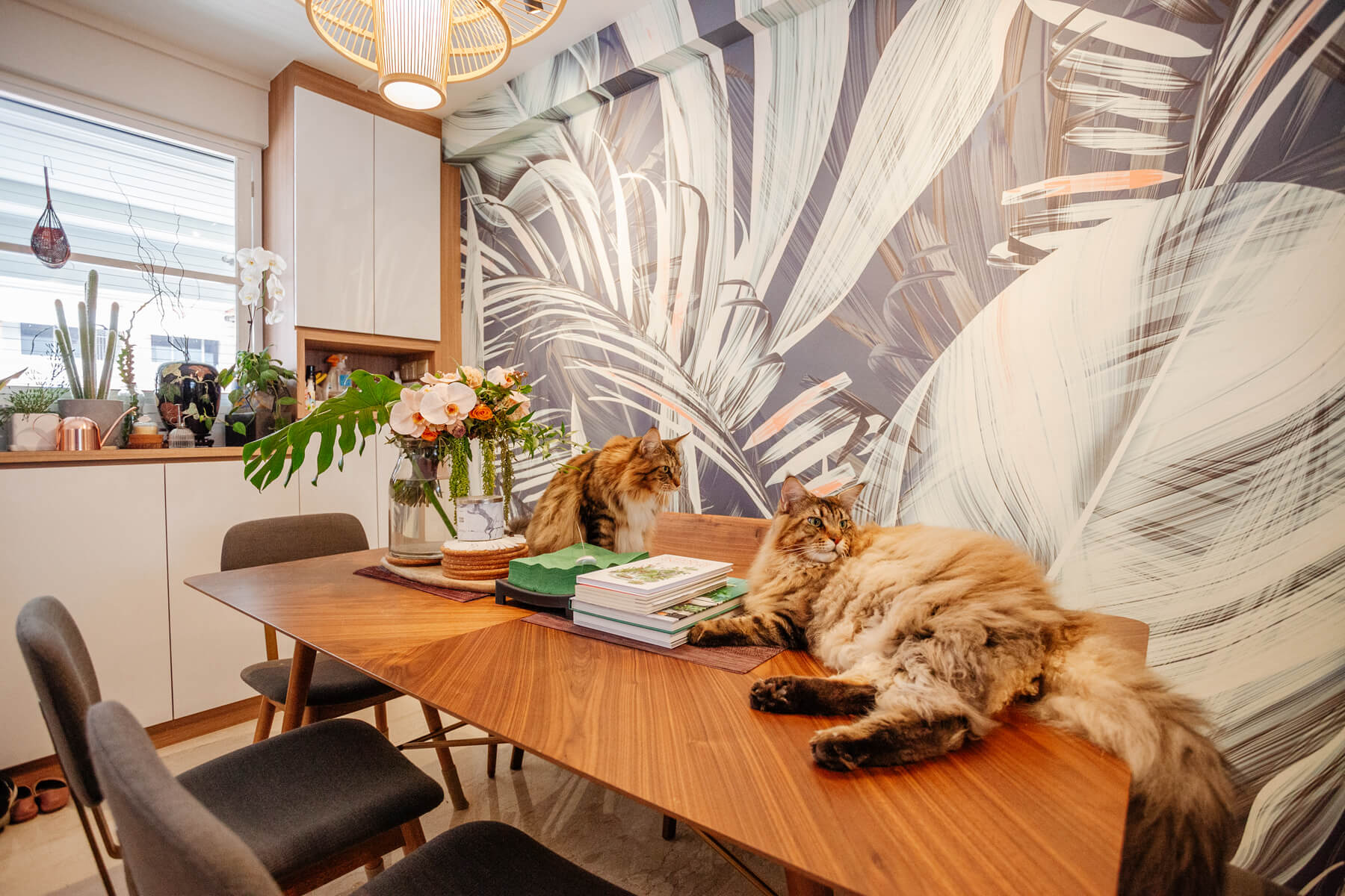
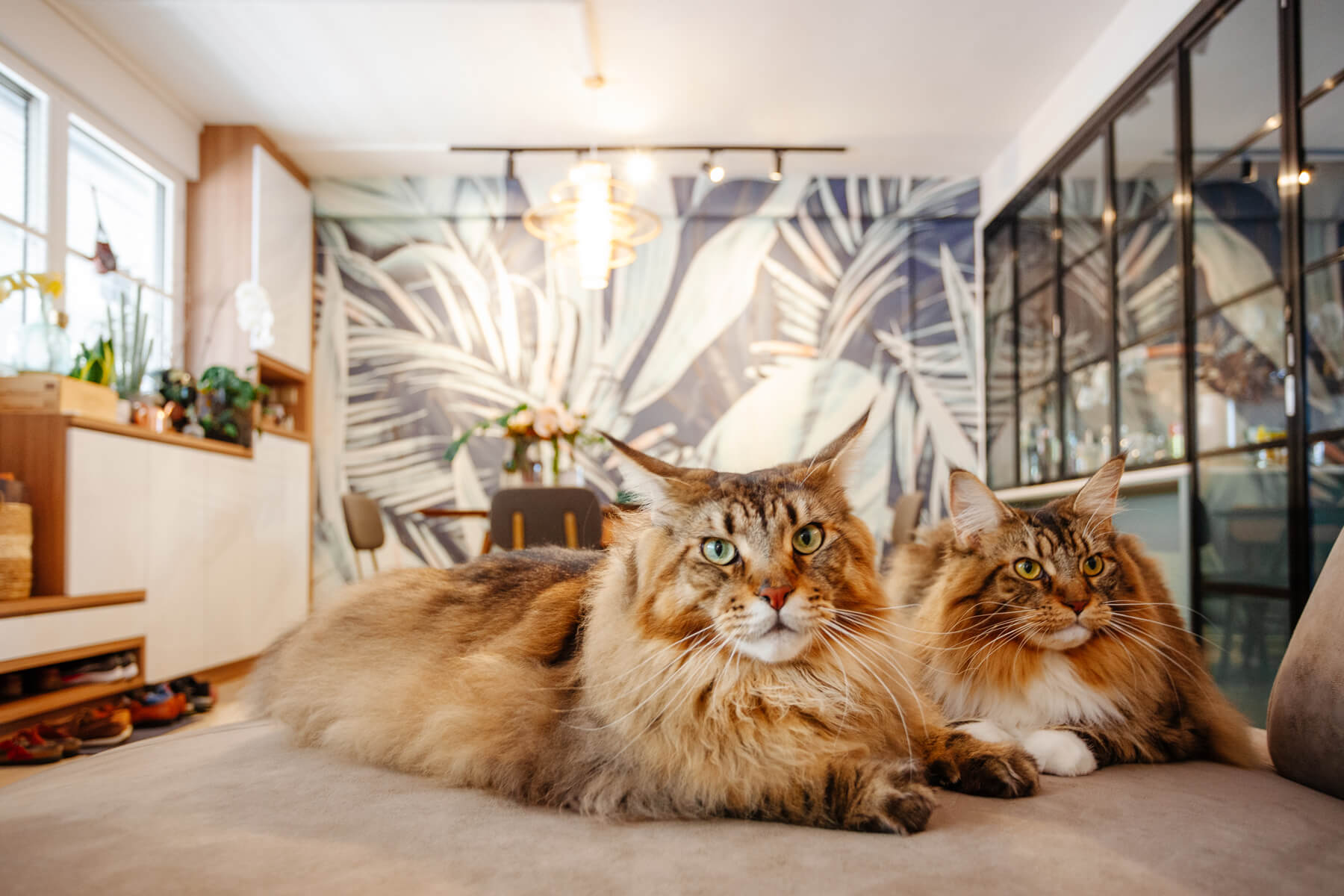
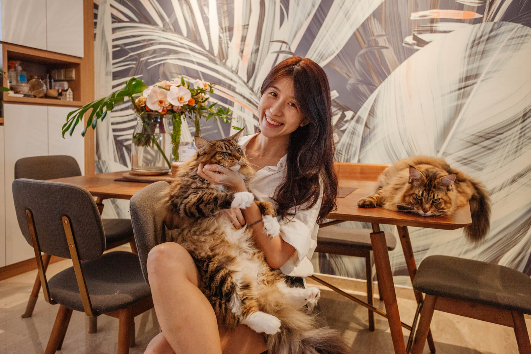
Home to two and their adorable Tabby Maine Coons, this relaxing apartment features a stylish mix of botanical prints, refreshing greenery, and design elements of Zoe and Wen’s favourite places.

Today, on Home with Wallhub, we are lucky to have Zoe to share with us their ideas and considerations which shaped their home to one that exudes the warmth of their family as well as an extension of who they are as individuals.

Read on to find out more!

Wallhub: Hi Zoe! Thank you for taking the time to share your home and interior styling tips with us. Would you tell us a little about yourself (and your family), and how long have you been living in this gorgeous space of yours?

Zoe: Hi Wallhub, thank you for featuring our home and having me too. My husband and I (together with our two little lions) have been calling this place home for about 2 years.

Wallhub Wallpaper Project Feature (Residential)

Wallhub: We love how cosy every corner of your home is! What is your inspiration?

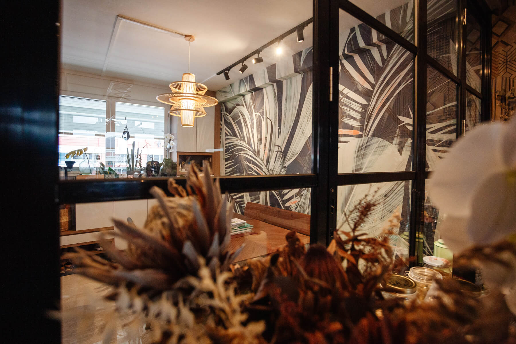
Zoe: Thank you! Both my husband and I really enjoy the nature and I especially love being surrounded by greenery (as you can tell by the wallpaper we chose and the number of plants in our home). At the same time, we wanted our home to exude the warmth of a family and be an extension of who we are as individuals. So we drew inspiration from Pinterest and the places we have been to or would like to go for example, the glass panels that resembles the French windows and the pendant lamp that transports us to a quaint Japanese nook.

Wallhub Wallpaper Project Feature (Residential)

Wallhub:  What were your key considerations when designing your space?

Zoe: To have loads of storage space, haha! We wanted to make sure that the carpentry was custom-built to our needs and at the same time not appear too bulky and dull. We also made sure we bought furniture that are comfortable and durable.

Aesthetics were also important because that impacts the look and feel of the home. So we spent a lot of time thinking about how to mix the laminate of the carpentry with the different textures of the home. We considered how the organic textures (e.g. Wooden grain) and synthetic textures (e.g. Brass finishing or fabric) of one furniture look and flow with another. We don’t want to be overly consistent but at the same time needed to make sure there was synergy in the aesthetics. We don’t make a purchase without extensive “eye-power” or what you call visualising work! 

A lot of people think that aesthetics and designing is “adding” and “putting together” concepts and ideas. Sometimes, it is also about dropping and cutting the fat. We dropped some design ideas and kept some of the walls “clean” to avoid saturating the space.

So, it was something of a balancing act between practicality, comfort, and aesthetics!

Wallhub Wallpaper Project Feature (Residential)

Wallhub: If you have got to pick one, which is your favourite part of the house, and why?

Zoe: The living and dining area!

It is where we can wind down with a book and a cup of tea (the little lions join us too) and at the same time host parties or have life-giving conversations with our friends and family. Due to Covid, we also got married in our living and dining area. So the space gives us a sense of calibrated simplicity and joy at the same time. We are so grateful for that.  

Wallhub Wallpaper Project Feature (Residential)

Wallhub: Your dining feature wallpaper looks great! How did you decide on the design?

Zoe: I think many were shocked when I told them that I had chosen my wallpaper even before I bought this place!

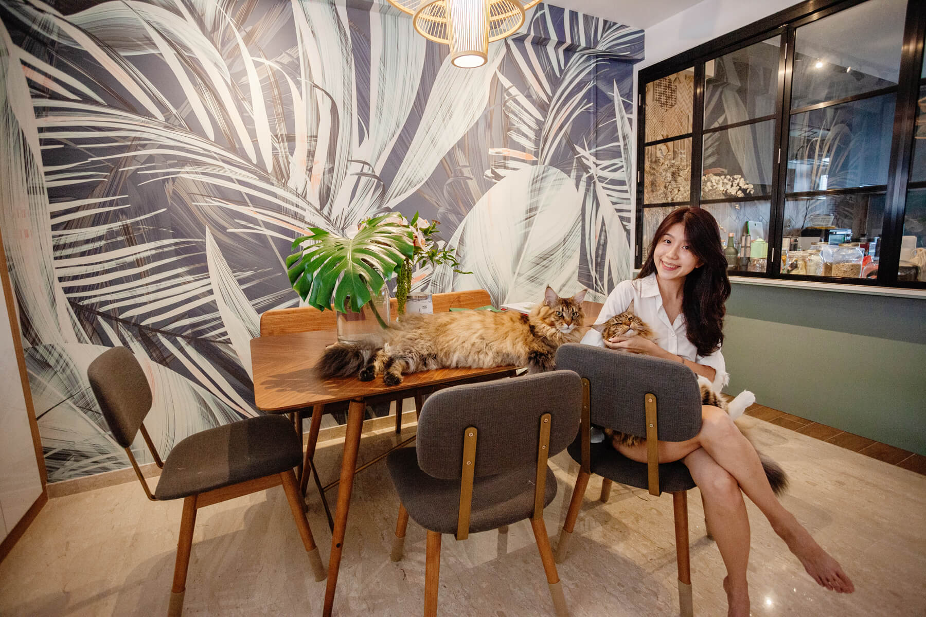
I chanced upon the design on Wallhub’s Instagram account and I fell in love with the look of large foliage and bold prints. The botanical design of the wallpaper and the bold colours were a juxtaposition of nature and modern living. That’s how I knew I wanted this to be a part of my home.

My husband then told me that although he liked having a “botanical” look he did not want live plants in the home, so I thought the wallpaper was the only way I could satisfy my dream of a jungle home. The wallpaper came, yes but eventually so did all the plants you see here in my living room. Oops.

The result? I think it looks pretty good! So, my husband is not complaining and no regrets at all.  

Wallhub Wallpaper Project Feature (Residential)

Wallhub: Tell us more about your experience with Wallhub!

Zoe: I had an easy experience coordinating with Wallhub. We met our sales assistant from Wallhub at the Home By Hitcheed event 6 months before we started renovation. Once we have confirmed the wallpaper, we linked up both Wallhub with our Interior Designer and all I needed to do was to choose my desired texture of the wallpaper and decide on the space where I wanted the wallpaper to be. My ID and Wallhub coordinated to ensure the measurements were accurate and viola, it all came together.

Wallhub Wallpaper Project Feature (Residential)

Wallhub: With 2 years in, how is the wallpaper holding up for you especially when your adorable furkids (Mochi & Matcha) are free to be where their hearts lead them?

Zoe: The wallpaper is holding up well! There were no issues on maintenance thus far and the texture does not catch dust too. Matcha and Mochi are both long fur cats and the wallpaper did not catch on their fur. My cats do not have severe scratching habits but even if they did, the wallpaper seem to have a very durable finish that will be able to withstand it.

Wallhub Wallpaper Project Feature (Residential)

Wallhub: Thank you so much for sharing, Zoe! Would you have any tips for other couples looking for inspiration to style their homes?

Zoe: Enjoy the process of your home styling and designing journey! Afterall, a home is not about how it looks but really about the people who lives in it.  


Wallhub Wallpaper Project Feature (Residential)

For more peeks into the lovely spaces of homeowners of #homewithwallhub, head on over here!
LondonArt | Exclusive wallpaper handmade in Italy

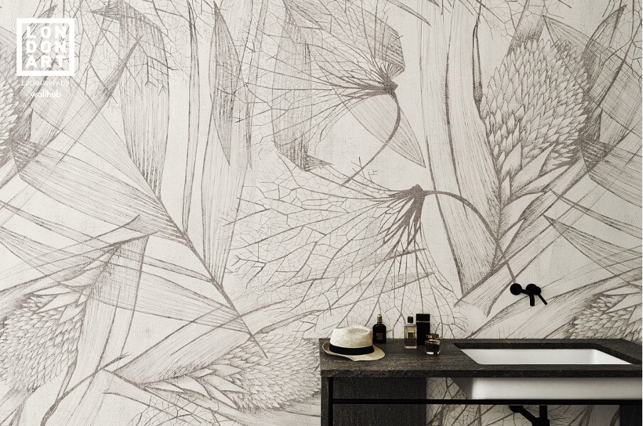
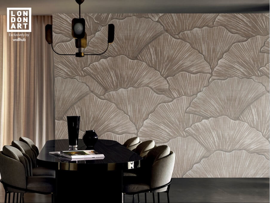
In the present day, wallpaper is not only about being a material that dresses a bare wall. It needs to be aesthetically pleasing, elevate the ambience and experience of the space. Most importantly, it is key for wallpaper to be practical. It should be easy to apply and ecological to remove for future interior updates.

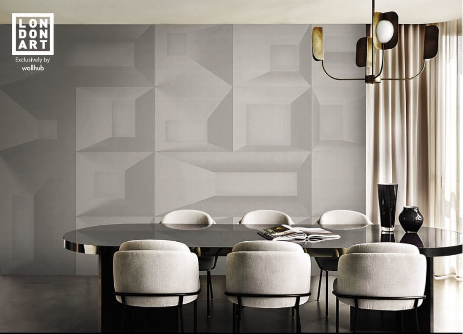
Excelling in these considerations while spearheading the wallcovering scene is Italian-based brand, LondonArt. Their stylish collections are derived by combining fashion, graphic and architectural elements. The explorative and innovative designs encompass the multiple creative facets of designers, illustrators and tattoo artists, tell tales like no other with the use of colour, perspective, and materials.

The designs are printed on high-level functionality wallpapers of different textures —  including water-resistant options made of fibre-glass that are ideal for bathrooms and wet areas. It is no surprise that LondonArt wallpapers are highly sought after by designers, architects, interior decorators as well as homeowners for homes, commercial, and hospitality projects all around the world.


Read on to find out more about LondonArt’s exclusive designs, their unique styles, and why they make great wallcovering options for your space!
 

  1. Exclusive Wallpaper Collection by LondonArt

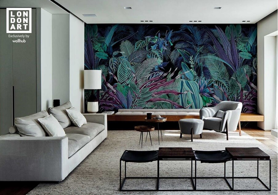
First on our list is the LondonArt collection. It is made up of collaborative works with designers, artists and more that brings you through a whimsical journey of breathtaking artistic interpretations, botanical prints, splash on a Dada or Macchiaioli painting, and even Art Deco references. You would be spoilt for choices, whether it is to find the perfect piece of finely carve Italian marquetry or lush scenery to create an interior teeming with jungle life.  


  1. Wanderlust by Marcel Wanders

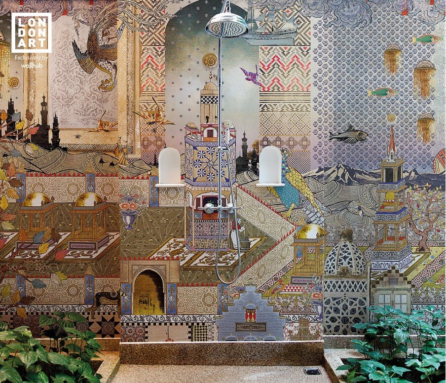
In this collection, Marcel Wanders Studio takes us on a unique journey, inspired by the lust to travel and experience cultures. The team of Dutch designers cast their vision on some of the world’s most alluring cities and their cultures while merging Marcel Wanders signatures of strong colours, architectural geometries, and zoomorphic elements like fruits, horses, and flowers. The result? Captivating and surreal decorative worlds that are reinvented using the eclectic design language that frames sidereal sceneries, botanical patterns, and distant visions that are sure to please anyone consumed by wanderlust.


  1. Luxury Shit by TOILETPAPER

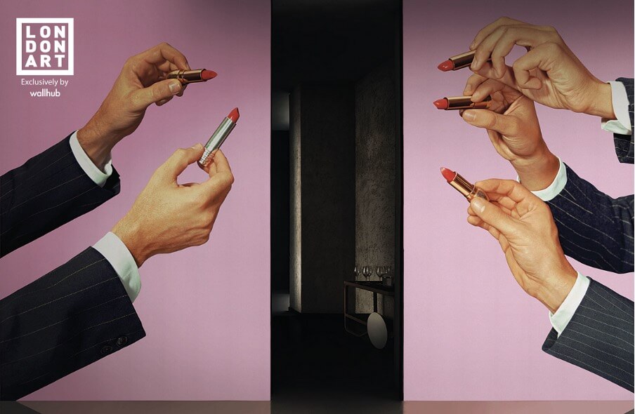
If pop art is your jam, this capsule wallpaper collection by graphic magazine, Toilet Paper, — founded by artist Maurizio Cattelan and photographer Pierpaolo Ferrar — will be right up your alley. This series of brash, provocative wallpapers aptly named Luxury Shit, features vibrant and bold images that combine commercial photography with pop suggestions, surrealist evocations, creating complex orchestrations that showcase the world of art in fresh new perspectives.

Each design starts from a subject and evolves into a complex juxtaposition of ideas, people, and objects, resulting in a sort of mental outlet. Luxury Shit for LondonArt is a curation of beautiful and bold images that magnetise people to Toiletpaper’s visual nonconformity —  a world of possibilities with objects of daily life embracing absurdity with arms wide open.


  1. The Daydreamer by Gio Pagani

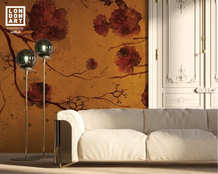
No stranger to the world of tasteful and stylish interior designs, Italian furniture designer — Gio Pagani, created this sophisticated and haptic wallpaper set that combines 1970s style with Japanese prints.

The Daydreamer set of wallpapers ranges from abstract geometrics and distinctive colourways of the 70s to repeating motifs of plants and animals, and more. Think large, snarling tigers in deep ochres and brown hues, oversized red flowers blossom from branches like a Japanese painting.

This collection also features a curated playlist to bring you an experience like no other. Talk about hitting all the right notes with aesthetics, function, and ambience!

LondonArt Wallpaper, how is it made and from what materials?

The head-to-tail production of all LondonArt wallpapers is carried out exclusively in Italy with Italian raw materials and cutting-edge technological systems. All designs from their collections can be printed on the following types of wallpaper.

  • Kanda
  • Raw
  • Greenwallpaper
  • Glass with Blue Glass Finish
  • Glass with White Glass Finish

The first 2 paper types listed are non-woven wallcoverings with different embossing. They are a made-to-measure material rendering of the environments.

Greenwallpaper is a non-woven, PVC-free fabric. It is suitable for indoor environments and is recyclable.

Next on the list is Glass. It is made from ultra-thin special fiberglass yarn. This cutting-edge technology shatters conventional limitations of wallpaper in your intimate and personal spaces at home.

With the Blue Glass Finish, Glass performs well in environments with running water, like the shower, back of sinks, and exterior walls. It has high mechanical and water resistance and is washable.

Glass in White Glass Finish is created for walls that require frequent cleaning and are subject to wear such as the backsplash of kitchens. It has high mechanical and impact resistance. It is also washable.


The Takeaway

LondonArt’s wallpapers are exclusive, imaginative, and luxurious. Their collection has an undisputed aesthetic appeal which is combined with functionality to result in strong, impactful solutions.

Their experimental and highly innovative wallpaper designs are the canvases on which today’s most exciting designers find space to dream. So let your imagination have the free-play as you dress your walls like never before.


LondonArt Wallpaper is now available in Singapore, exclusively at Wallhub.

Visit our showrooms to find out more in person here.

Gift your loved ones a unique Valentine’s Day present

Valentine’s Day is a crucial day to any couple though they might not say it out loud or admit it to anyone. It’s the one day dedicated to test the limits on how creative you can get and well, the more outrageous the gesture, the more you care.

First thing’s first, forget the calorie-induced chocolates, flowers that wither over time and sappy love poems that take hours to write – We’ve got a way to better show your ‘lobster’ how much you really love them!

A lot of time and pressure goes into planning magnificent dates and flashy gifts. Get your +1 a gift that is not only unique, but will look stunning and last ages.

Wallpaper.

Not the first thing that comes to mind, we know. However, wallpaper is a necessary piece of art to any home. You could be revamping the entire look and feel of his or her room with just one big gesture. From leafy botanic prints to marble prints which are highly popular to the age of millennials, we’ve got a wide array of stunning engaging designs to suit your partners unique sense of style. 

If you are getting it for your lady, think of how wonderful her selfies will turn out with a new and beautiful backdrop! And for men, imagine how cool it would be when he has the boys over for a game of Fifa or loud boy-blather. We can all say goodbye to the horrid days of hanging hippie printed beach towels on our walls that collect dust and fall to the ground every now and then.

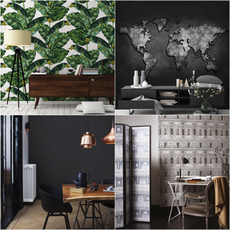
We’ve accumulated 8 wallpaper styles/designs that your significant other might love to have in their room or living space!

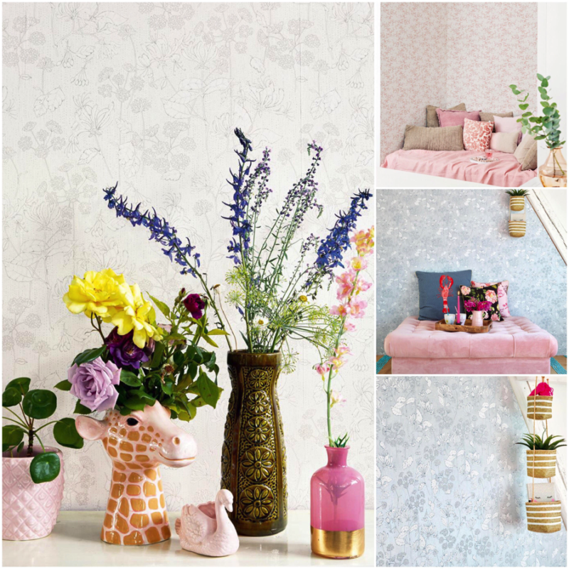
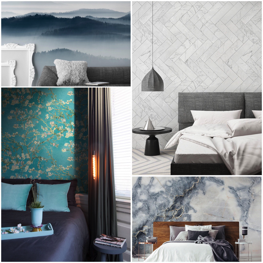
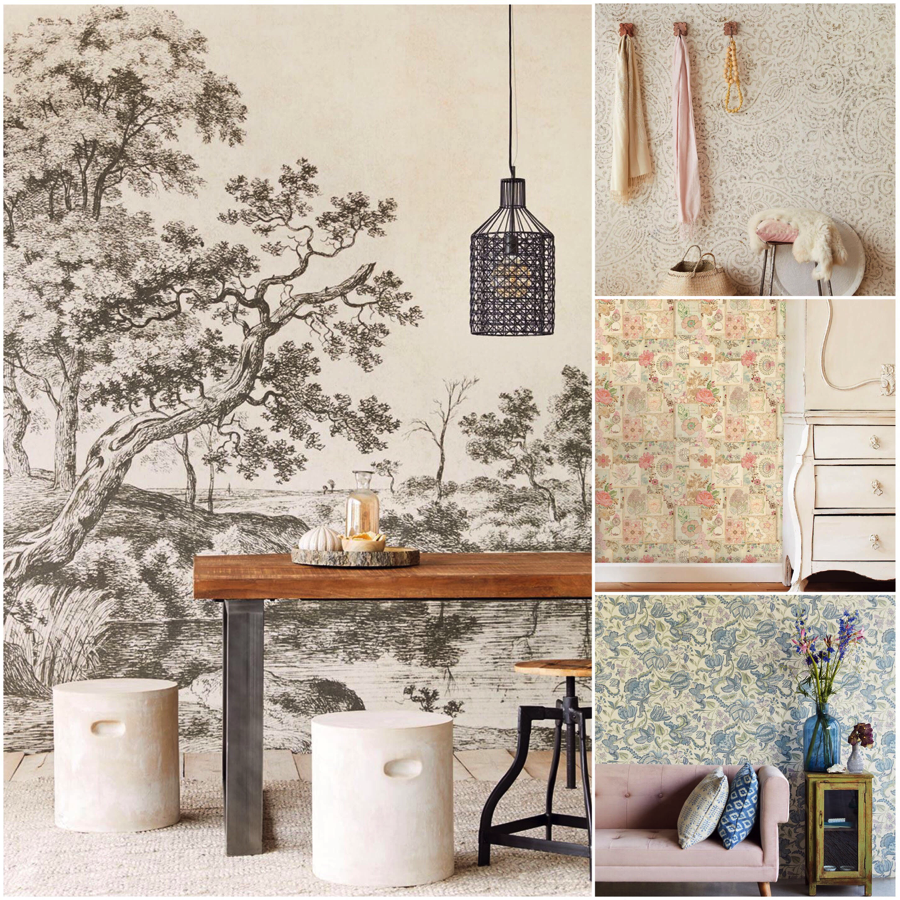
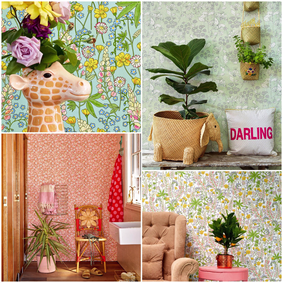
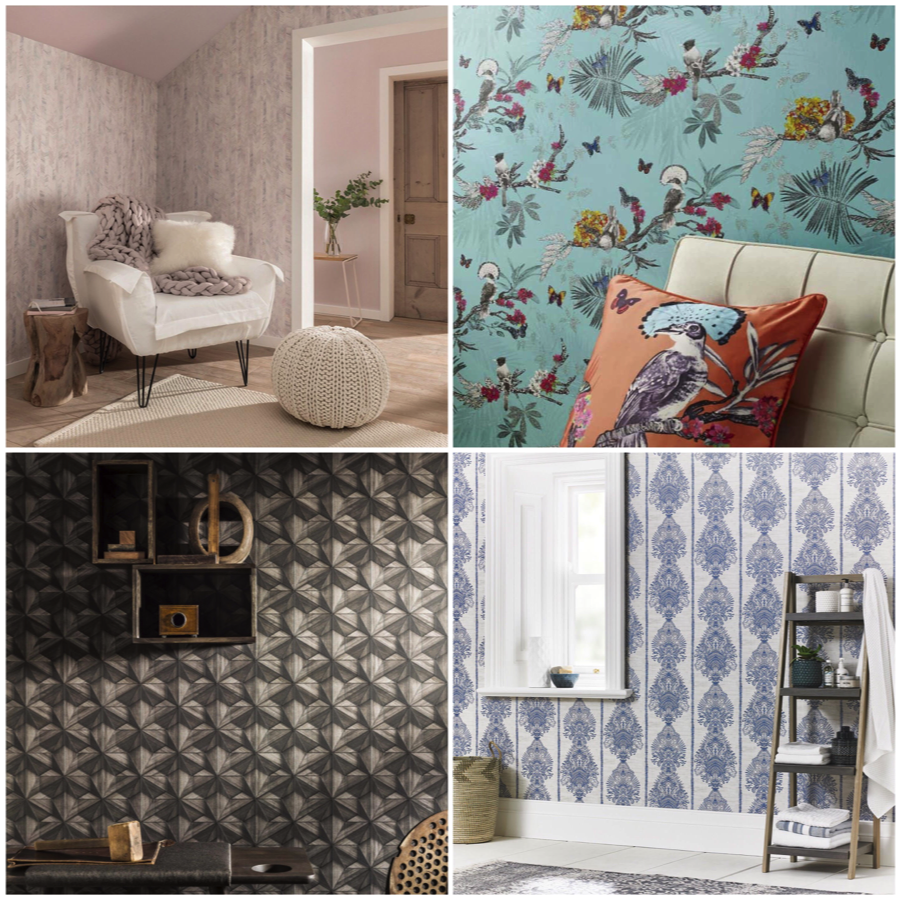
1. The Bright and Cheerful

2. The Bold and Cool

3. For the Feminine in you

4. Beauty in Blooms

5. The Timeless Classic

6. Sweet Vintage

7. For the Botanical Lovers

8. Of Textures and Patterns


Contact us or visit any of our Showroom outlets to find out more:

www.wallhub.com.sg

sales@wallhub.com.sg

+65 64937217 | +65 94897623 | +65 90066632


Locations:

(1) Showroom (Main)
#01-10 (Level 1 & 2), Nordcom II, 2 gambas Cres, S757044

(2) Showroom @ Oxley
#01-38, Oxley Bizhub 2 62 Ubi Rd 1, S408734

(3) Showroom @ KASTONE Gallery®
#01-22, Oxley Bizhub 2 62 Ubi Rd 1, S408734

The Benefits of Wallpaper Vs. Paint

Many would hold fast to the traditional myth regarding the durability of paint over wallpaper, which could possibly be debated over decades.

A report conducted by Jim Hite – The Bell Systems analysed how wallpapers would last five times longer than paint, up to 15 years. On the other hand, painted surfaces require frequent cleaning to maintain its appearance and repainting approximately every three years.

In today’s day and age aside from durability, economies of scale is on the top of the list for new house owners. Even though the initial investment may be slightly higher when it comes to wallpapering your home, you will find that in the long run you can possibly save up to 30% compared to using paint.

Wallpaper 01

Moving on to the aesthetic appeal of both mediums, wallpapers has an edge over traditional paint. Painted surfaces could only have the following options:-

  • Flat: A single colour for each wall
  • Textured: Paint containing a separate media to give it texture.
  • Custom: Mural designs using paint.
  • Faux Finishes: Custom paint designs that add pattern and depth.


On the other hand, there are many other unique features that one can only obtain with wallpapers and they are as follows:-

  • Flat: Single color wallpapers
  • Accent: Can be achieved by utilising wallpaper on one wall.
  • Textured: There are many varieties of textured wallpaper from plain to ornate.
  • Custom: Mural prints that can be customised to suit your home
  • Faux Finishes: Most popular faux finishes have their wallpaper counterparts.
  • Photographic: Consider creating custom wallpaper designs with your own family portraits


An increasing trend spotted in restaurants, homes and even offices are textured wallpapers. The versatility of wallpaper provides countless colours, shades and patterns to give you the exact look and feel you are going for.

Wallpaper 04

Textured wallpapers provide you with the flexibility of creating fun and bold statements for each room. An example of the rooms commonly adopted for textured wallpapers can be ‘man caves’ and recreation/movie rooms. Aside from adding in that touch of fun, using an image to replicate the look you are going for and using wallpapers instead of the actual material will help you save cost.

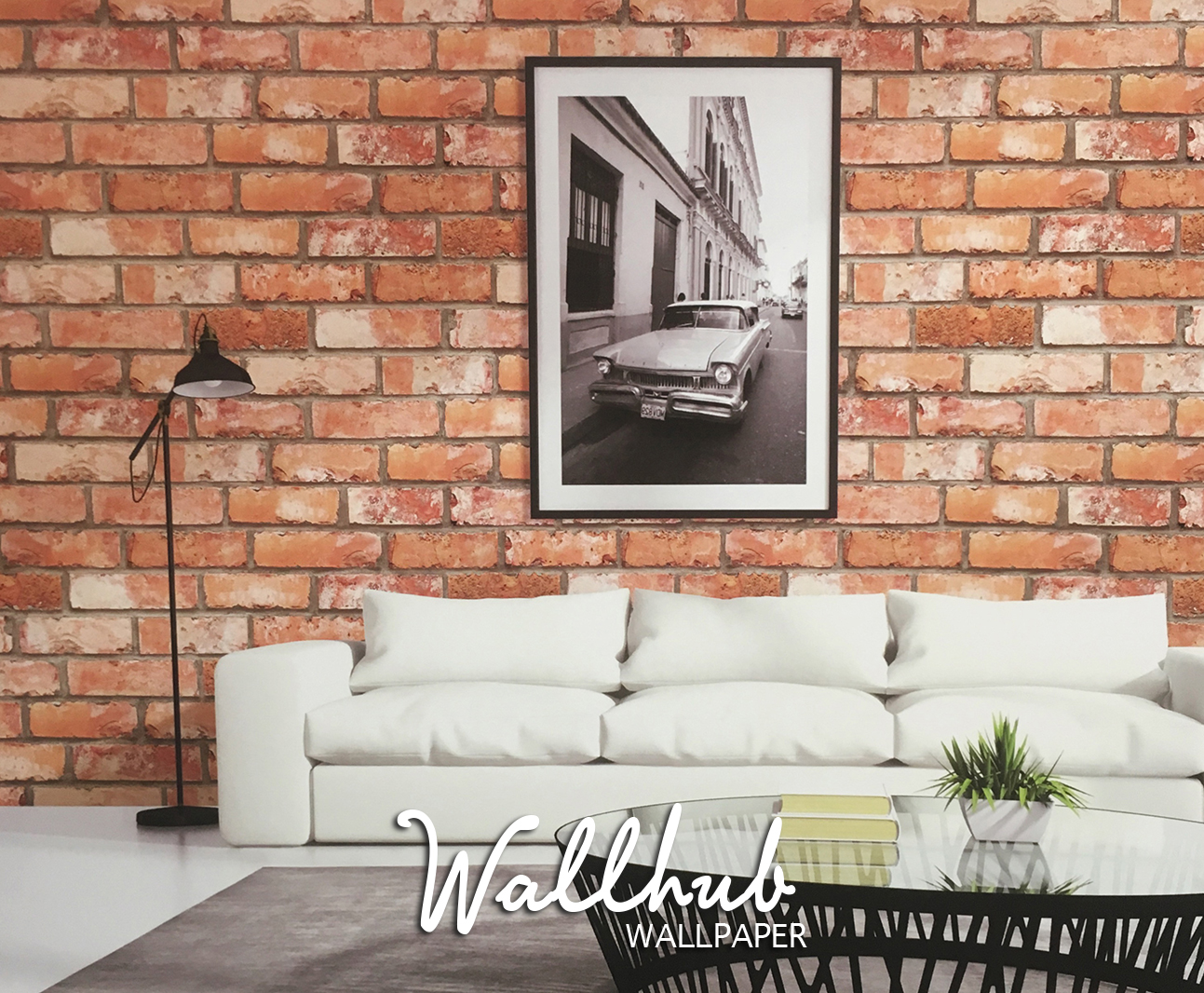
One example could be the rustic brick wall look, instead of hacking down a wall to replace it with actual bricks, one could use the image of bricks to create that effect instead.

Wallpaper 11

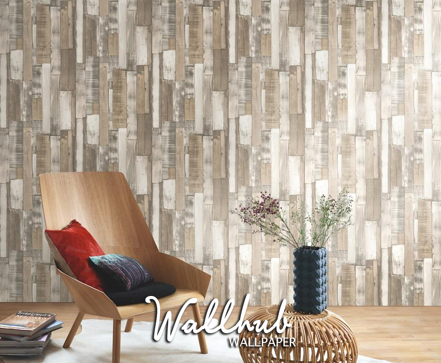
Other variations can range from ancient roman life and architectural connotes to faux marble or wood designs. You can also switch it up and use two wallpaper designs (one plain and one patterned) to create depth and uniqueness. Textured wallpaper with period designs can help transform your space to another time and place, without having to physically be there.

Wallpaper 10

At the end of the day, it is important to spend some time researching materials to ensure that the wallpaper you choose will go well with the lighting, temperature, humidity, and traffic of the room in question.

Feel free to drop us a call at 87218242 or email us at sales@wallhub.com.sg should you have more queries about wallpapers and your future home.


View our gallery for more Products Selection »

Handy Tips For Selecting The Right Wallpaper

What colour should you select?

Selecting the right base colour for your wallpaper is very important as that will affect the overall tone for your apartment or room.

A dark or busy choice of wallpaper design may cause a small room to appear cramped and smaller than its actual size. On the other hand, selecting a light or neutral shade will allow natural light to bounce off the walls, creating an illusion of a larger space.

Wallpaper 03


General guidelines

Here are some general guidelines for colour schemes to consider:

1. Warm Colours
Red, yellow and orange are warm colours that are often used in dining areas and helps to create a more inviting atmosphere in the room.

2. Cool Colours
Blue, green and lavender are cool colours that are often used in bathrooms or smaller rooms. These colours are used in areas such as the kitchen, porches or areas where afternoon heat is a factor. These colours help to create a calming and tranquil atmosphere.

3. Light Colours
Light colours help to create bright and spacious rooms and reflects light. Selecting a light colour would help to brighten a dark hallway and not compete with your furnishings.

4. Dark Colours
Dark colours help to create an intimate setting for a room, as these colours absorb light and helps to cover up uneven wall surfaces.

Wallpaper 07


How much space do you have to work with?

Remember that different types of wallpapers can create different visual effects. If you are selecting a large patterned print, bear in mind that it could make your room appear smaller. However at the same time, achieving that cosy effect with a large room.

If you are looking to create a high ceiling effect for your home, consider selecting vertical stripes or patterns. On the other hand, if you are looking at creating a wider room, horizontal stripes or patterns is the way to go.

You may also consider having geometric prints as part of your wallpaper design to create depth, causing your room to appear larger than it is.

Wallpaper 06

Feel free to drop us a call at 87218242 or email us at sales@wallhub.com.sg should you have more queries about wallpapers and your future home.


View our gallery for more Products Selection »