Choosing the right wallpaper for your home is more than just a design decision; it’s a choice that can significantly influence your mood and overall well-being. Colour psychology, the study of how hues affect human behaviour, can be a powerful tool in creating the desired ambience in your living space.
This article explores the impact of different colours on your mood and provides guidance on selecting the perfect wallpaper to foster a positive atmosphere in your home.
The science of colour psychology
Colour psychology is based on the premise that colours can evoke specific emotions and responses in people. While reactions to colours can be subjective and influenced by personal experiences, certain colours tend to evoke similar responses in many individuals. Understanding these associations can help you make informed decisions when decorating your home. For those looking for quality options, consulting a wallpaper supplier in Singapore can provide additional insights and selections tailored to your needs.
Warm colours: Energising and Invigorating
Warm colours like red, orange, and yellow are known for their energising and stimulating effects. These hues can make a room feel more inviting and vibrant.
- Red: Red is a powerful colour associated with passion, excitement, and energy. It can increase heart rate and stimulate the senses, making it ideal for social spaces like living rooms and dining areas. However, too much red can be overwhelming, so it’s best used as an accent colour or in moderation.
- Orange: Orange combines the energy of red with the happiness of yellow. It is associated with enthusiasm, creativity, and warmth. Orange can be a great choice for playrooms, home offices, or kitchens, where a lively and stimulating environment is desired.
- Yellow: Yellow is the colour of sunshine and happiness. It promotes a cheerful and optimistic atmosphere, making it perfect for kitchens, bathrooms, and hallways. However, like red, too much yellow can be overpowering, so balance it with neutral tones.
Cool colours: Calming and Relaxing
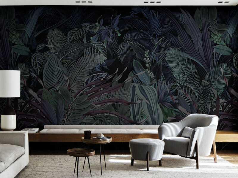
Cool colours such as blue, green, and purple are known for their calming and soothing effects. These hues can help create a tranquil and peaceful environment, perfect for relaxation.
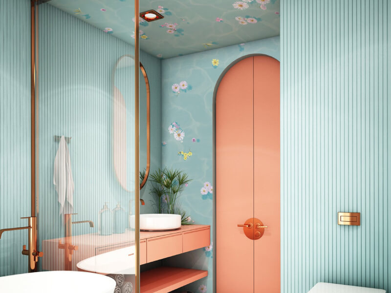
- Blue: Blue is often related with calmness, serenity, and stability. It can lower blood pressure and create a sense of tranquillity, making it ideal for bedrooms and bathrooms. Lighter shades of blue can make a room feel airy and spacious, while darker shades can add depth and sophistication.
- Green: Green represents nature and is linked to feelings of balance, harmony, and renewal. It is a versatile colour that works well in almost any room, particularly in spaces where you want to promote relaxation and comfort, such as living rooms and bedrooms.
- Purple: Purple is associated with luxury, creativity, and introspection. Lighter shades like lavender can evoke calmness and are perfect for bedrooms, while darker shades like plum can add a touch of elegance and sophistication to living spaces.
Neutral colours: Versatile and Timeless
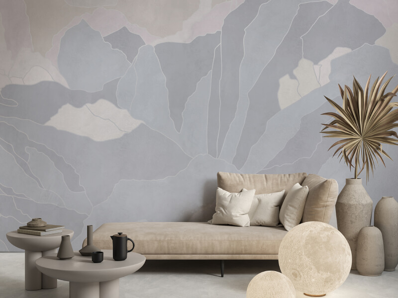
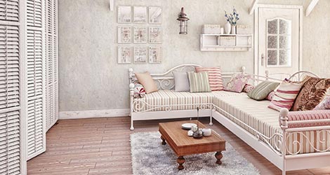
Neutral colours such as white, grey, and beige provide a versatile backdrop that can complement any colour scheme. Neutral interior designs are timeless and can create a sense of balance and simplicity in your home.
- White: White is associated with cleanliness, simplicity, and purity. It can make a room feel larger and more open, creating a blank canvas for other design elements. White is perfect for any room, but it is especially popular in kitchens and bathrooms.
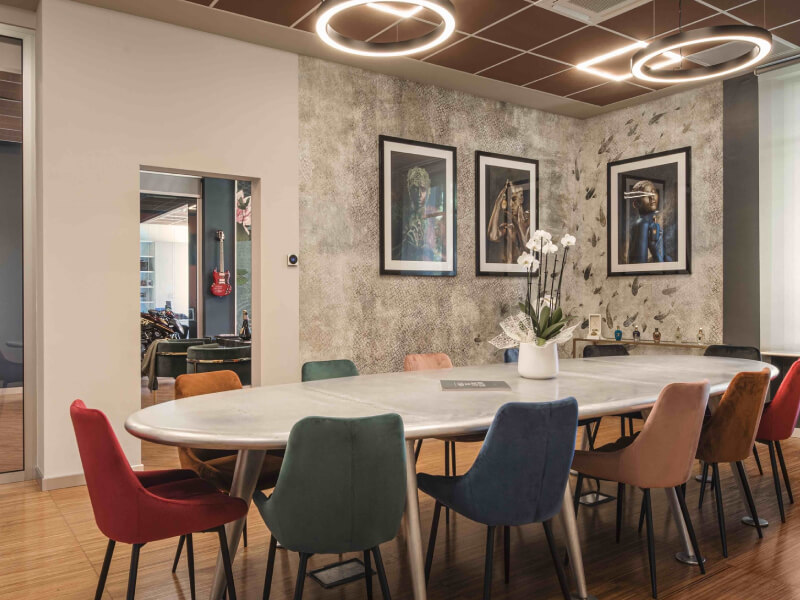
- Grey: Grey is a sophisticated and versatile colour that can create a calming and balanced environment. It works well in modern and minimalist designs and can be paired with almost any other colour. Grey is a great choice for living rooms, bedrooms, and offices.
- Beige: Beige is a warm and inviting neutral colour that promotes a sense of calm and comfort. It is an excellent choice for living rooms, bedrooms, and hallways, providing a soft and soothing backdrop that works well with various design styles.
Selecting the right wallpaper for each room

When choosing wallpaper, consider the primary function of the room and the mood you want to create. Here are some tips for selecting the right wallpaper based on colour psychology:
- Living room: Opt for warm colours like red or orange to create an inviting and social atmosphere. If you prefer a more relaxing environment, consider cooler tones like blue or green.
- Bedroom: Choose calming colours like blue, green, or lavender to promote relaxation and restful sleep. Neutral tones like grey or beige can also create a serene and tranquil space.
- Kitchen: Bright and cheerful colours like yellow or orange can make your kitchen feel lively and energetic. If you prefer a more modern look, consider white or grey.
- Bathroom: Light blues and greens can create a spa-like, calming environment. White is also a popular choice for bathrooms, as it promotes a sense of cleanliness and simplicity.
- Home office: Opt for colours that stimulate creativity and focus, such as green or blue. Orange can also be a good choice if you want to create a more energetic and vibrant workspace.
Conclusion
Colour psychology can be a powerful tool in creating the perfect ambience in your home. Whether you’re looking to energise your living room, create a calming bedroom retreat, or design a cheerful kitchen, the right colour can make all the difference. Use this guide to help you select the perfect wallpaper that not only enhances your décor but also improves your overall well-being.